Packaging + Brand Concept + Copywriting + Identity + Product Photography
Student / Cornish College of the Arts
Timeline: 5 Weeks
Brief
Design recyclable packaging for a new olive oil marketing consumers ages 21-35 years of age.
Solution
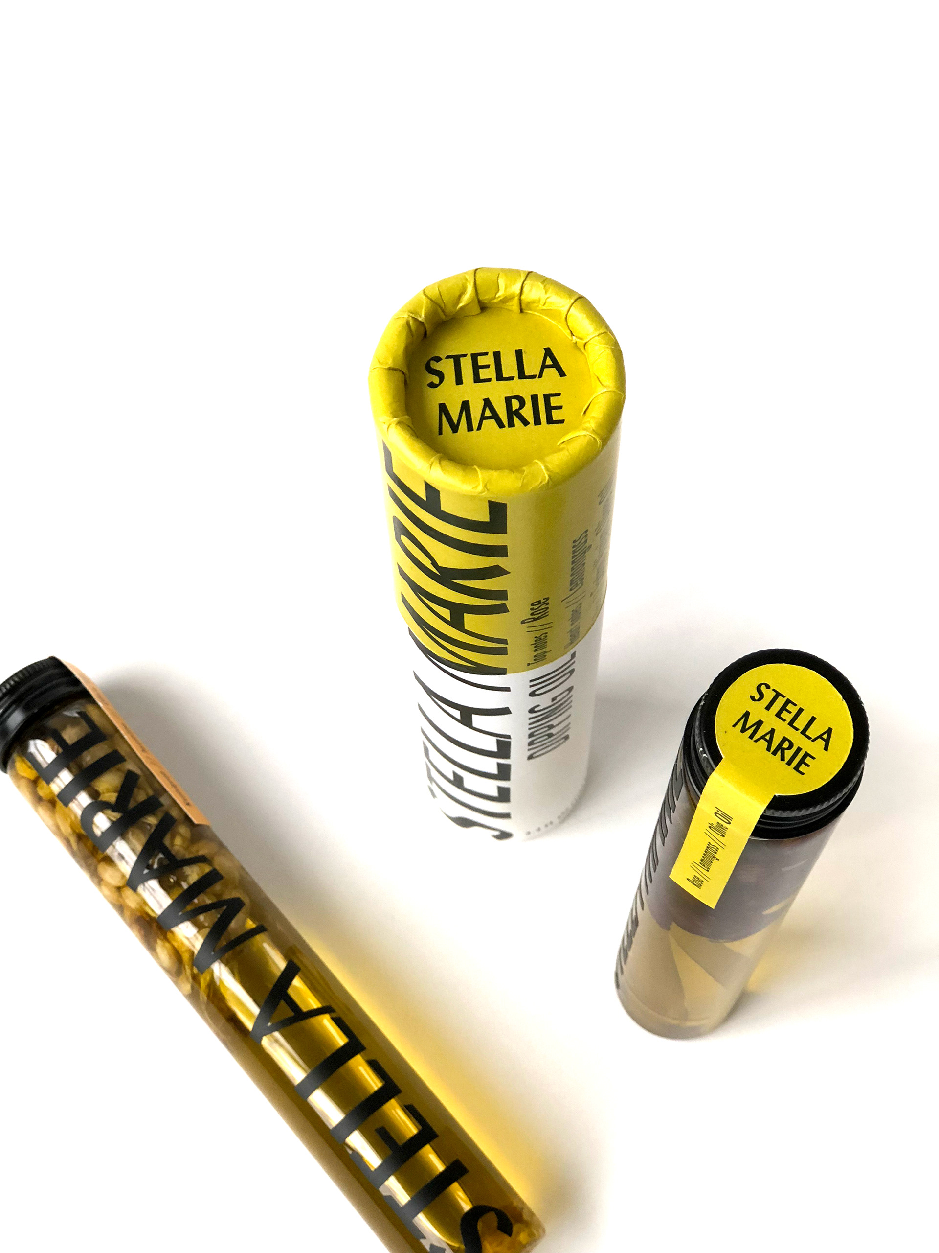
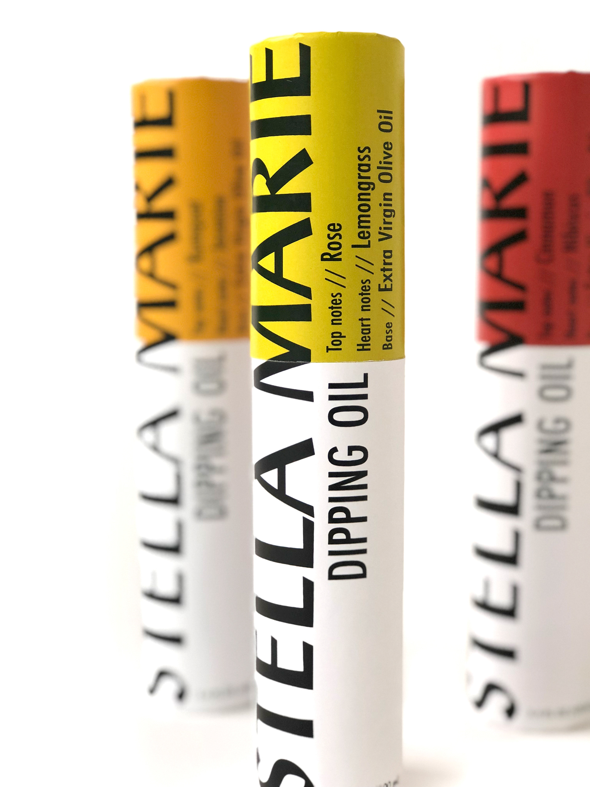
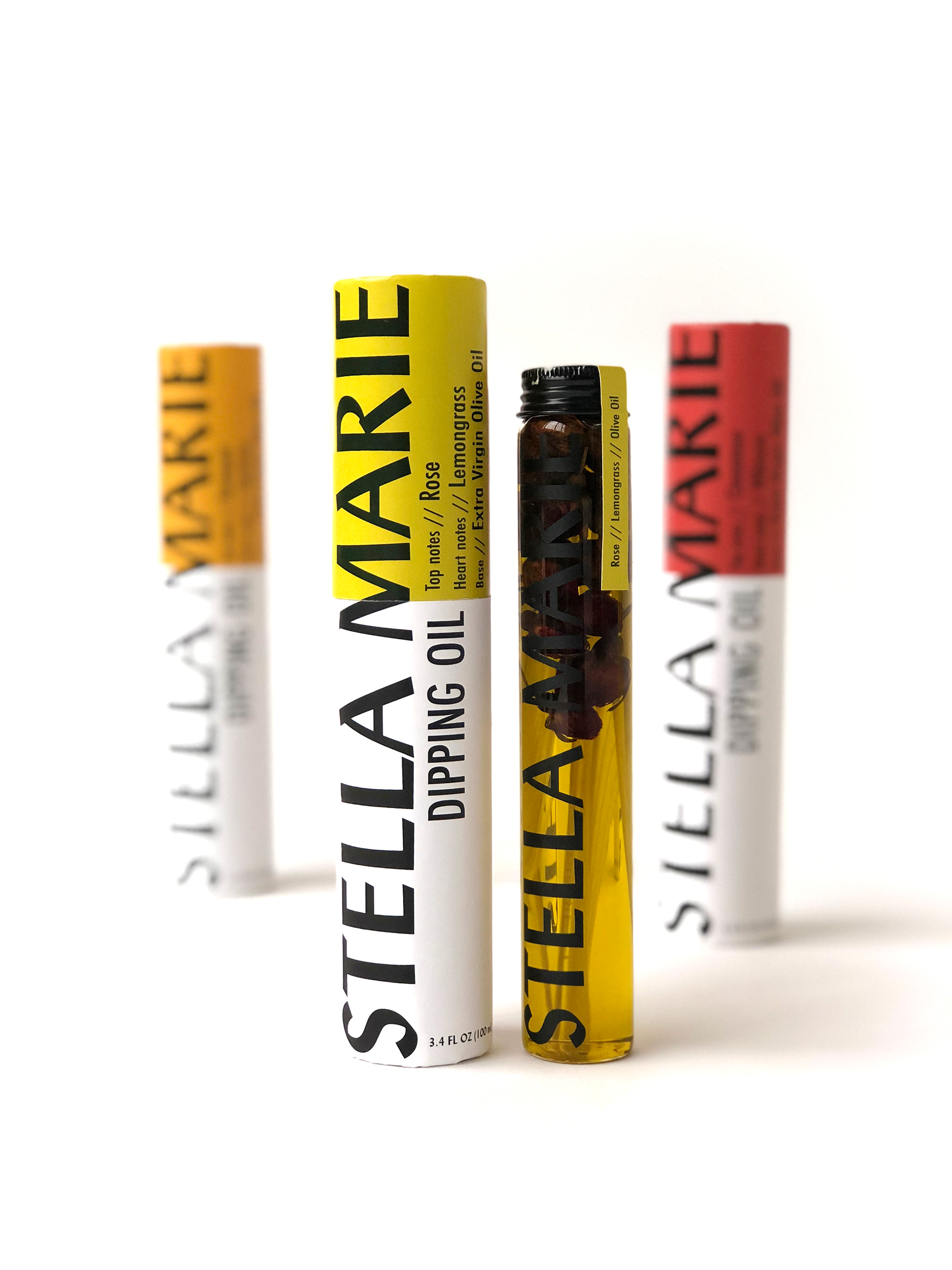
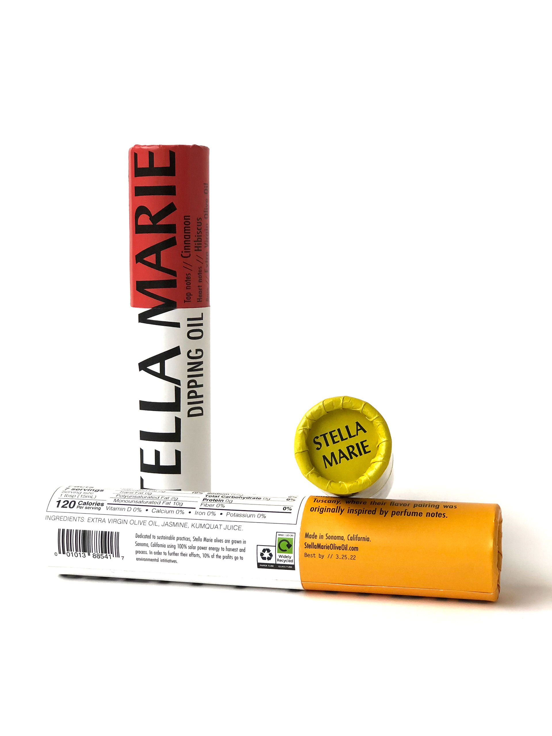
The target demographic for Stella Marie Olive Oil is 18-34 year old’s who are on a budget but are still looking for a unique experience. The target demographic is conscious of the waste they produce, so they look for products with recyclable or compostable packaging. The outer packaging is recyclable thick kraft paper, and the tube is recyclable aluminum cap with glass tube. Recycling symbols on outer shell indicates how to dispose of all parts. This extra virgin olive oil is infused with flavors inspired by perfume notes and as a result work best as dipping oils. The small net weight allows for a cheaper price point rather than committing to a large or expensive bottle of an unconventional flavored oil. The size makes this olive oil great as a gift, sampler size or a snack between friends at a small house party.
Deliverables - Nikki Lim
Brand Concept
Copywriting
Brand Identity
Dieline
Packaging
Product Photography
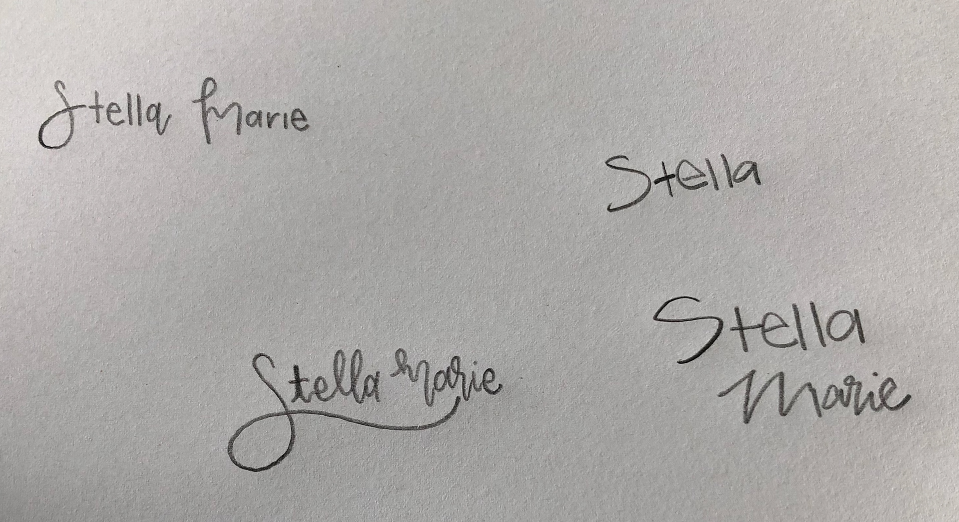
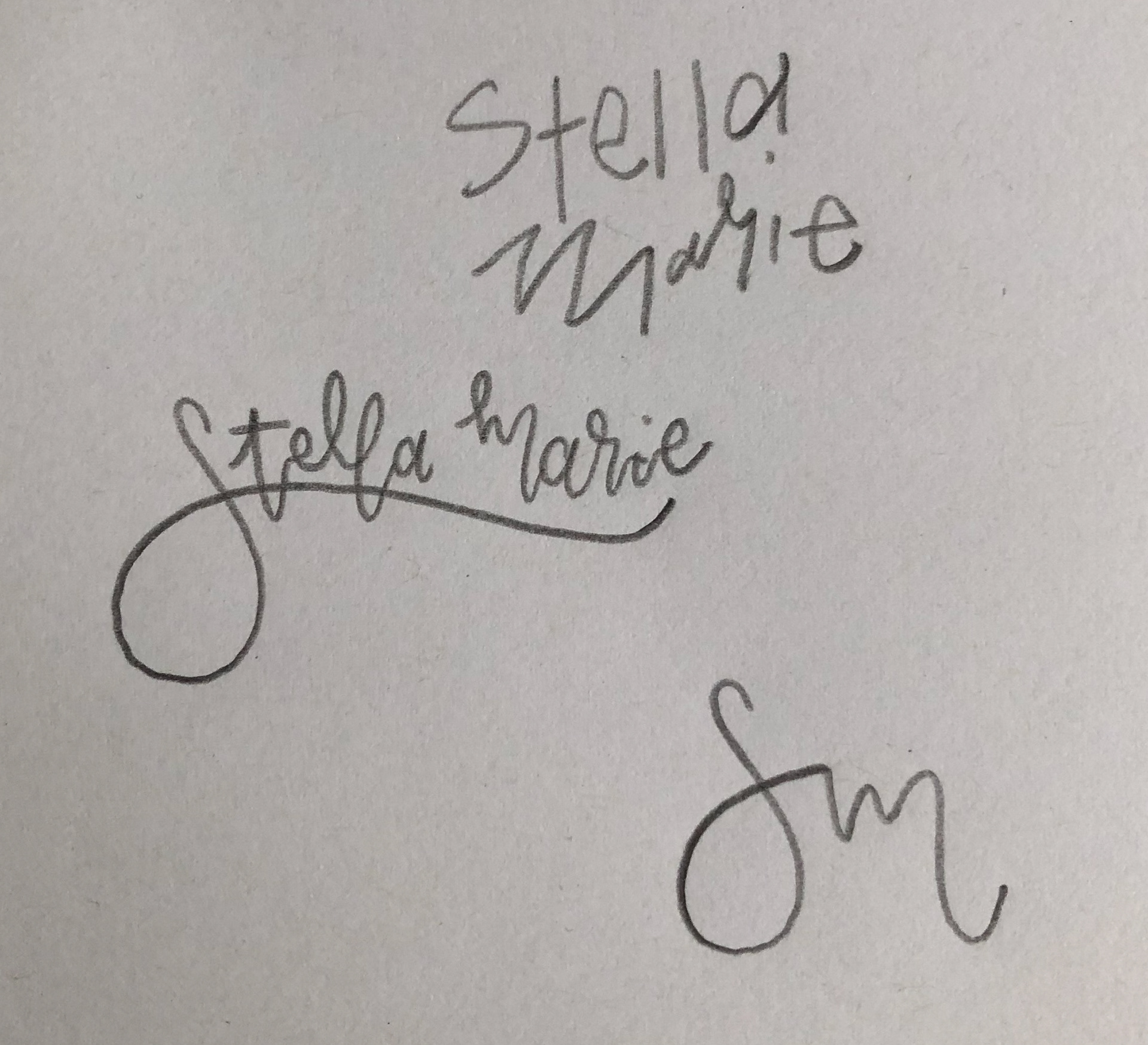
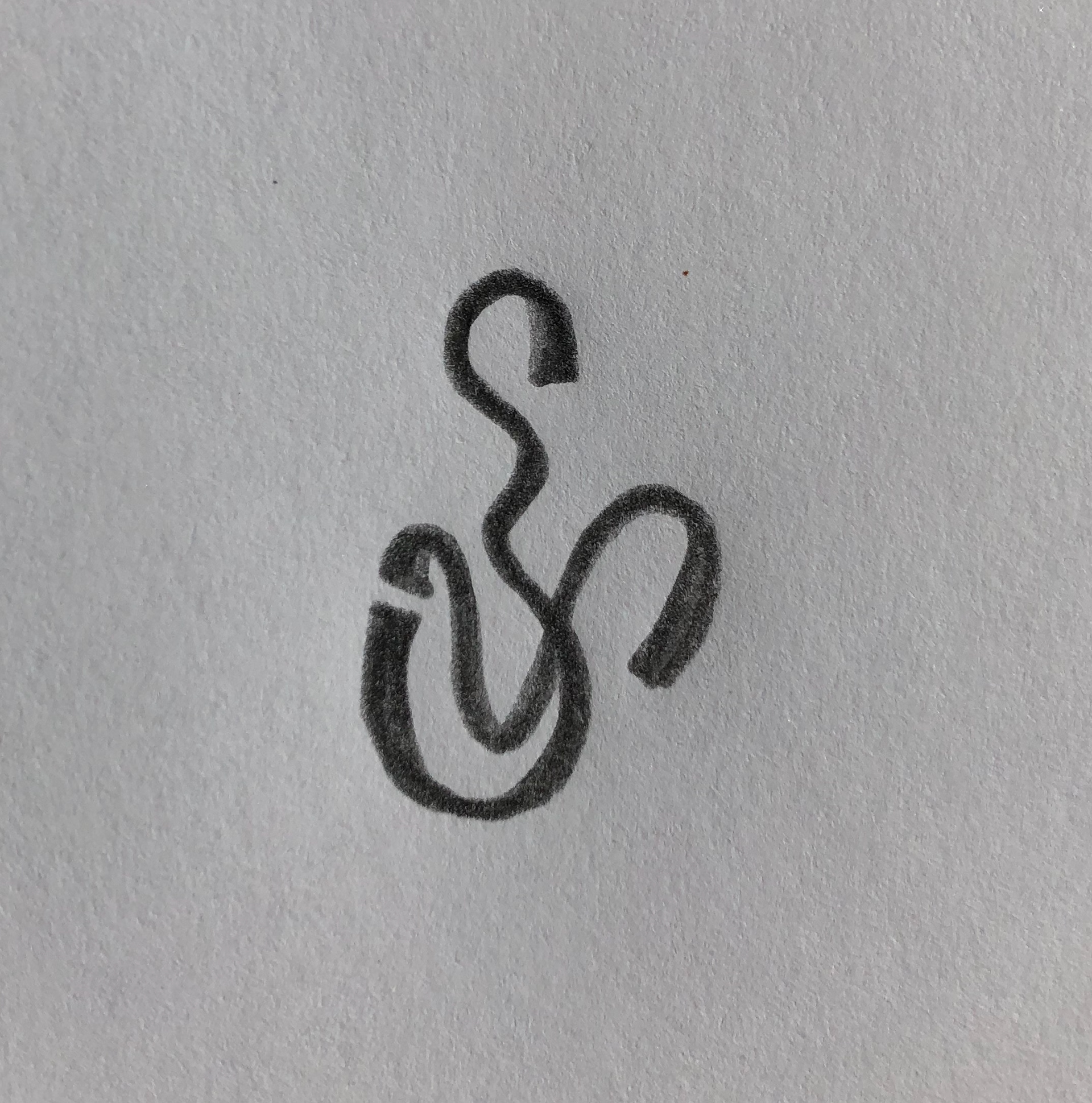
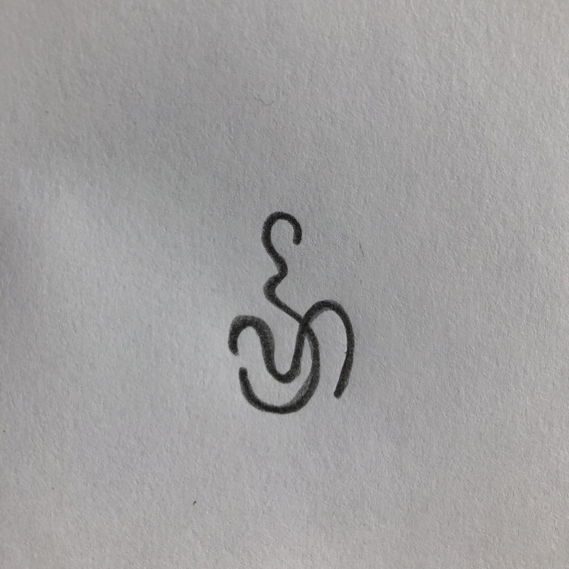
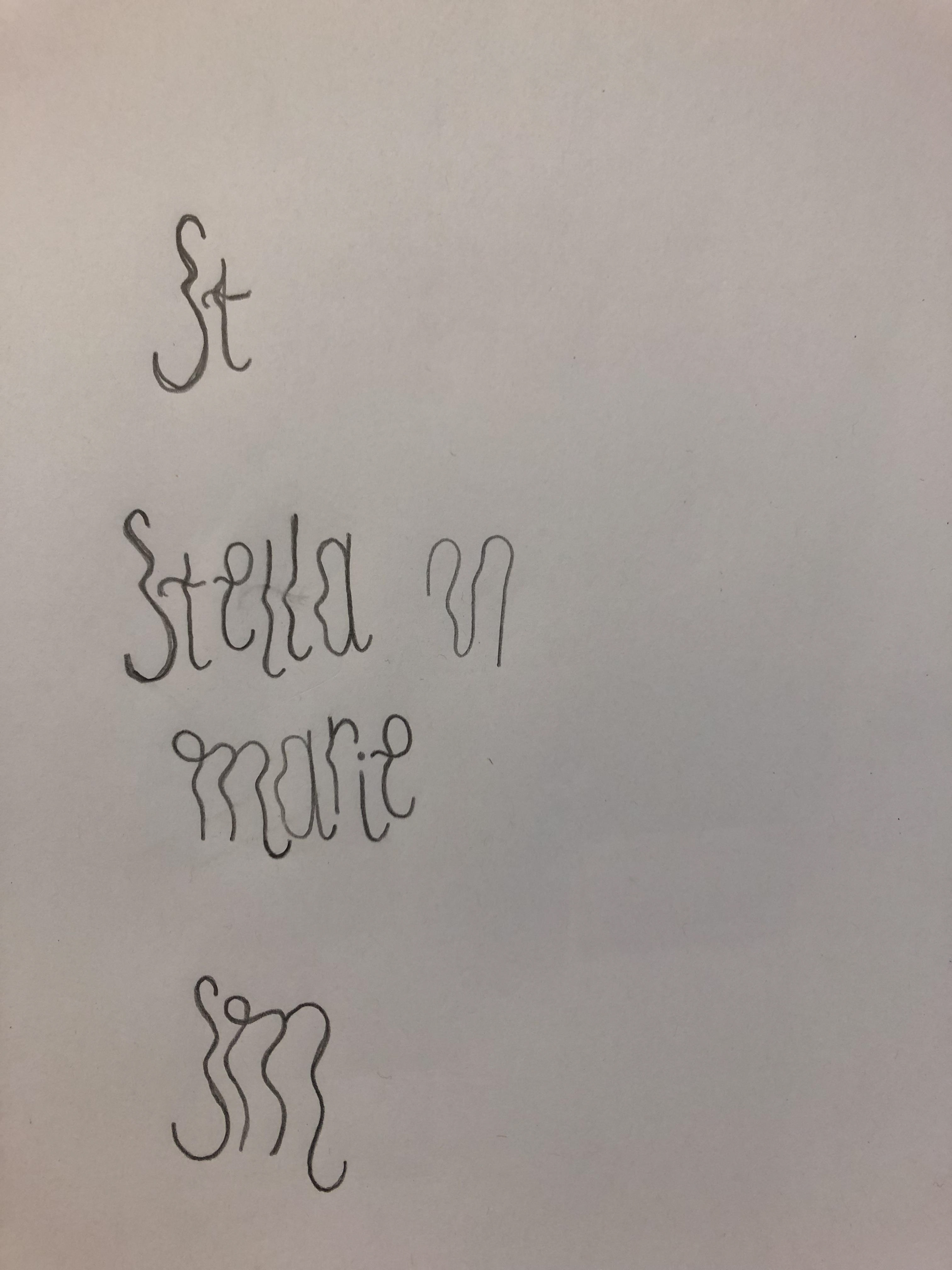
Initial Sketches
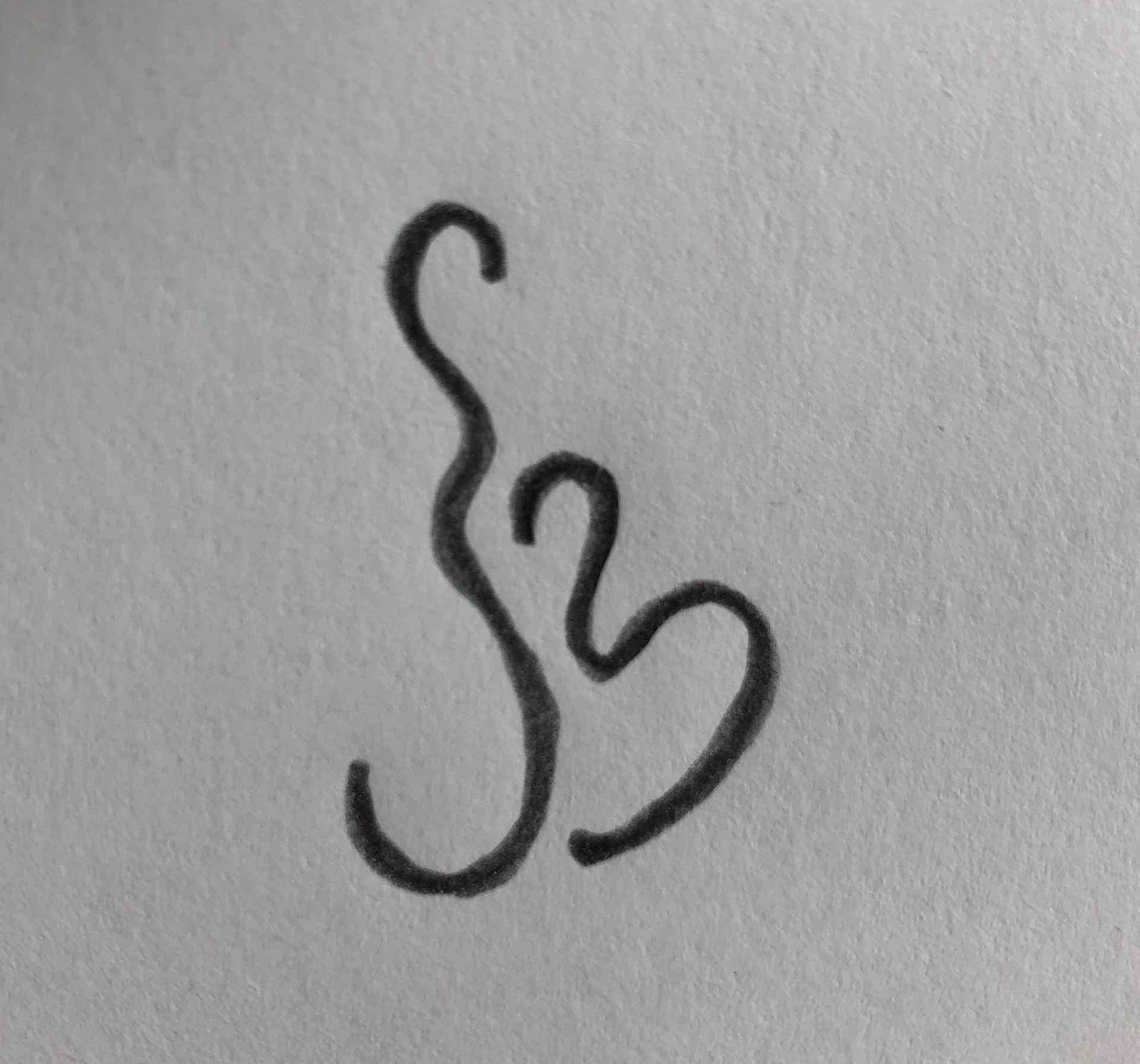
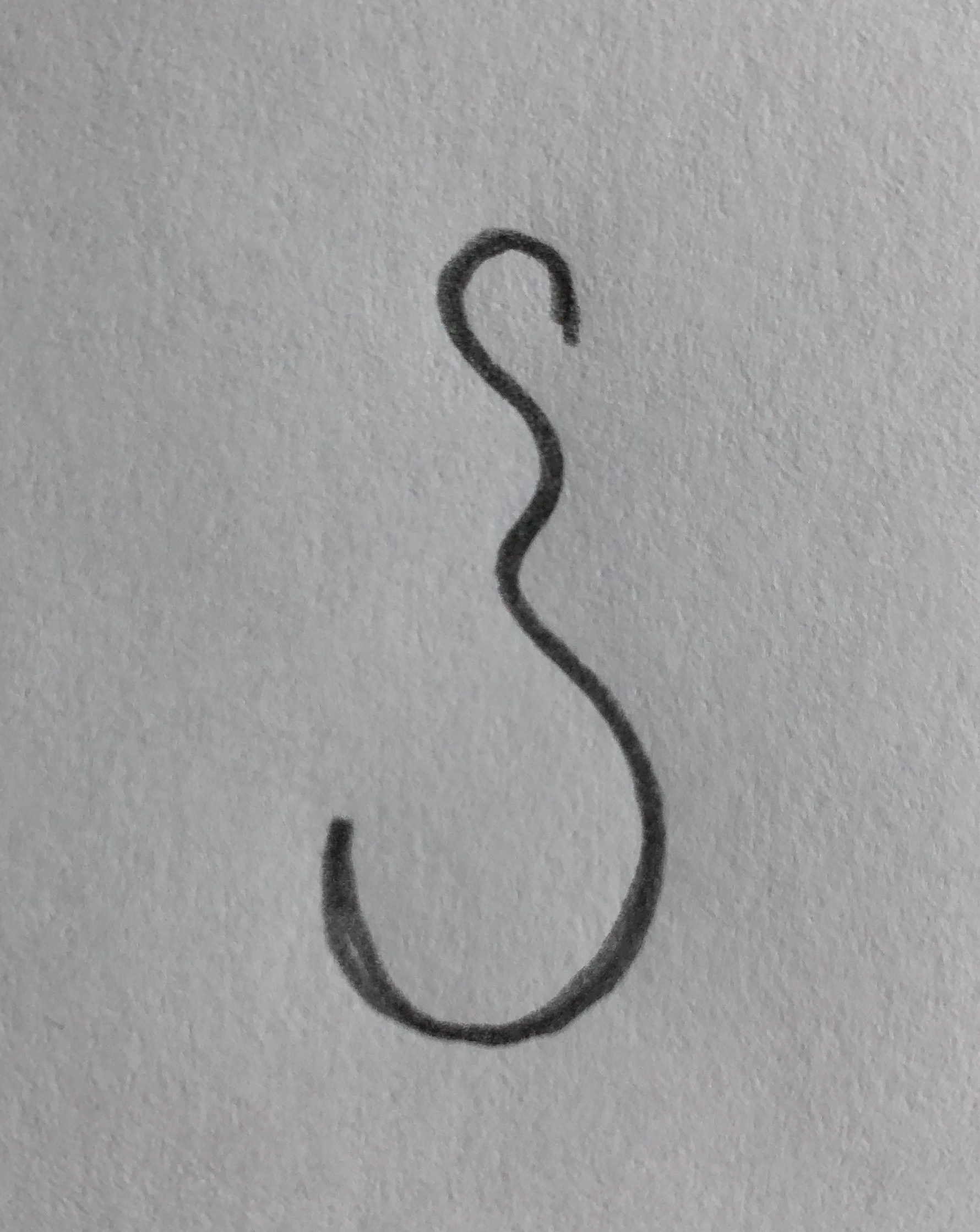
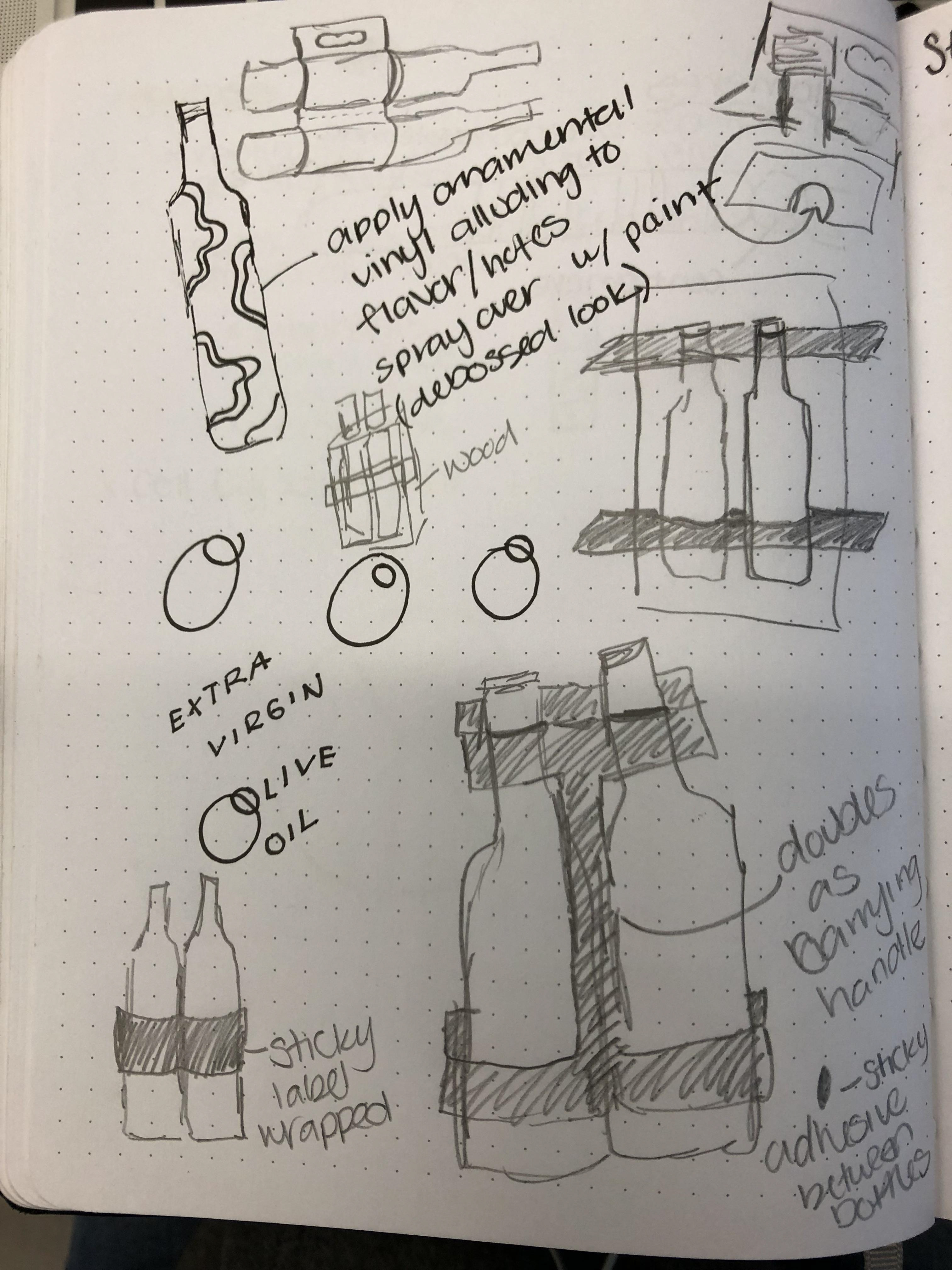
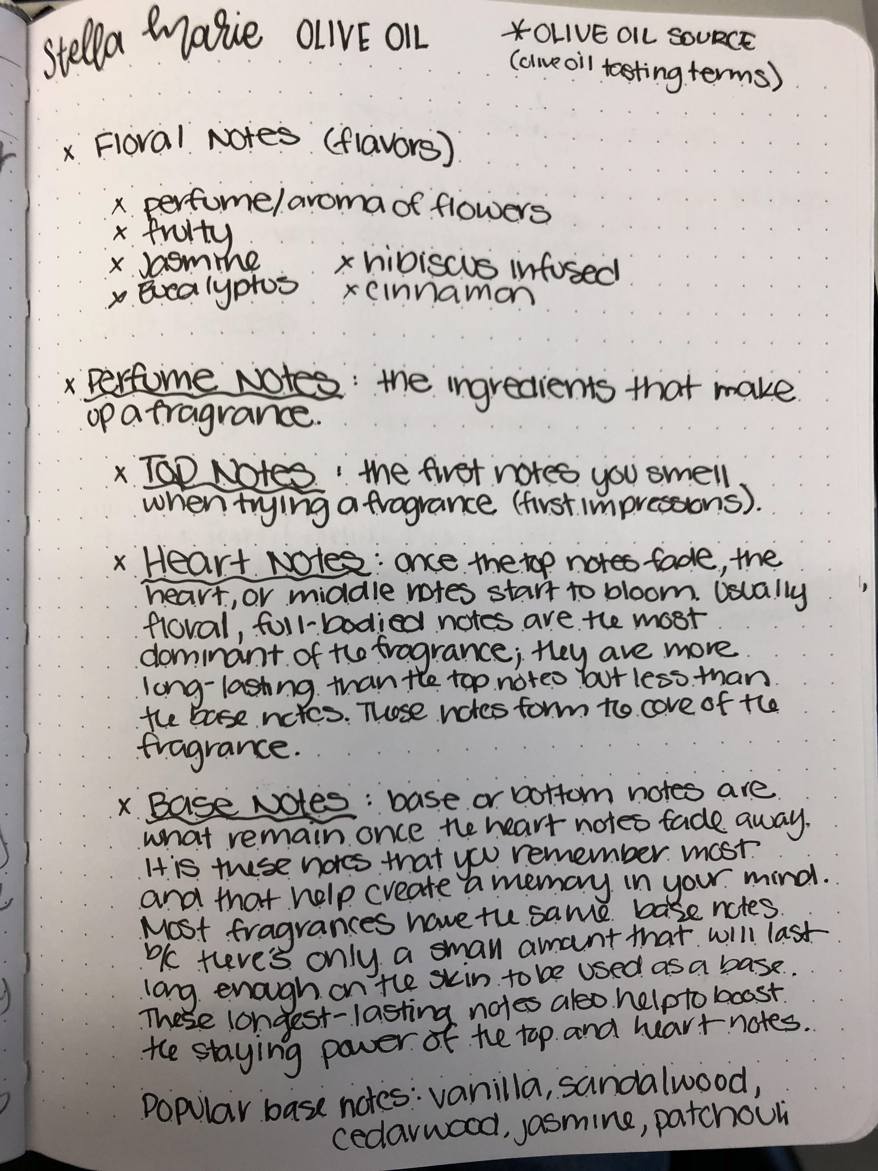
Before the conceptual presentation was established, I sketched out possibly logo directions and rough packaging form ideas.
Conceptual Presentation
Below is the conceptual presentation stating a persona meant to paint a picture of the Stella Marie target demographic, visual direction moodboards, outer packaging ideas, logo sketches and logo type inspiration.
The first visual direction was black and white with an overall sophisticated design whereas the second visual direction was full of organic shapes and a colorful color palette. In the end, I went with the more sophisticated direction with three pops of color meant to signal flavor. The logo type idea influenced the final logo type chosen. The first packaging idea for glass tubes influenced my choice of packaging form.
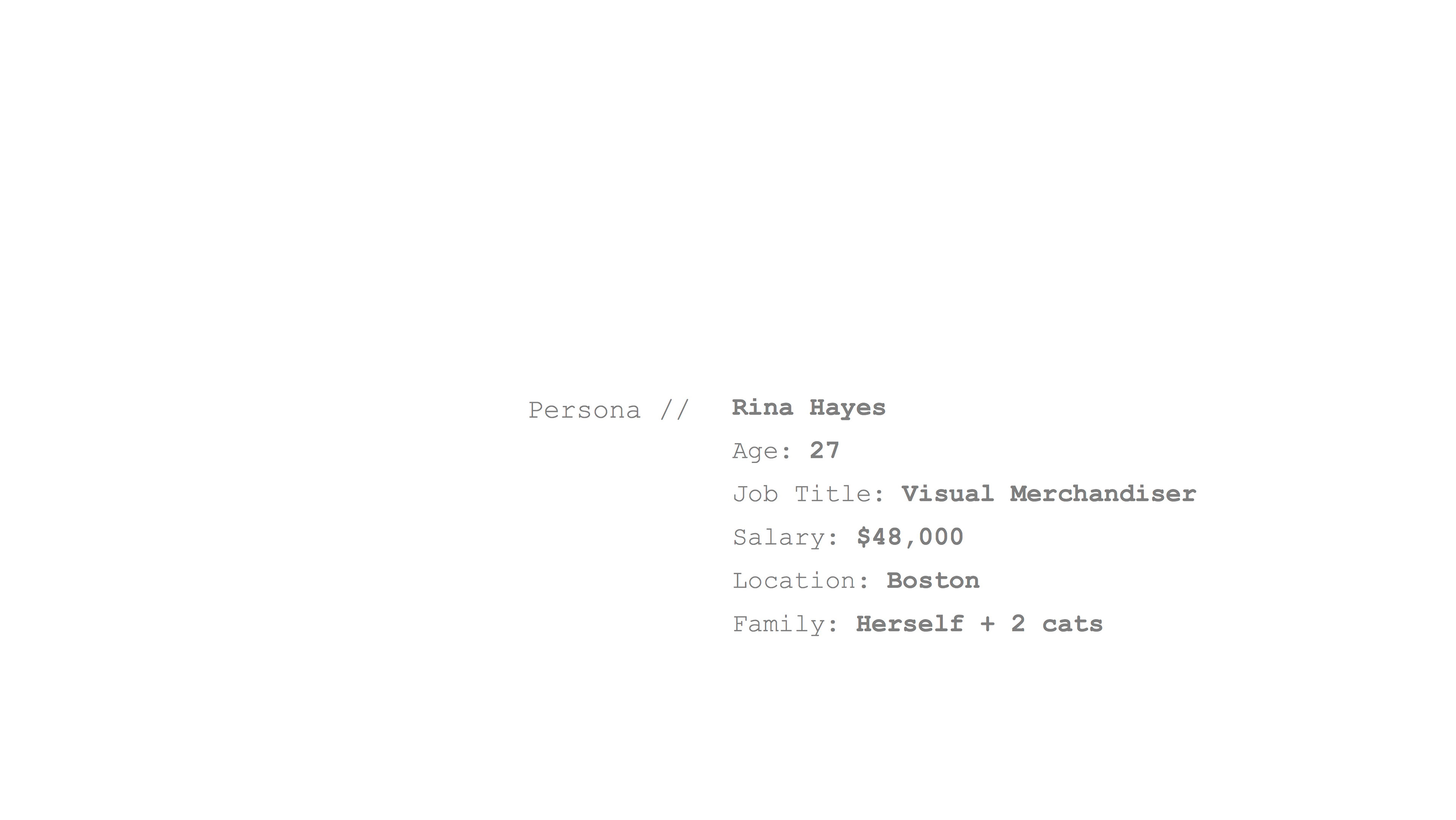
Persona // 20-40 year olds looking for unusual olive oil flavors.
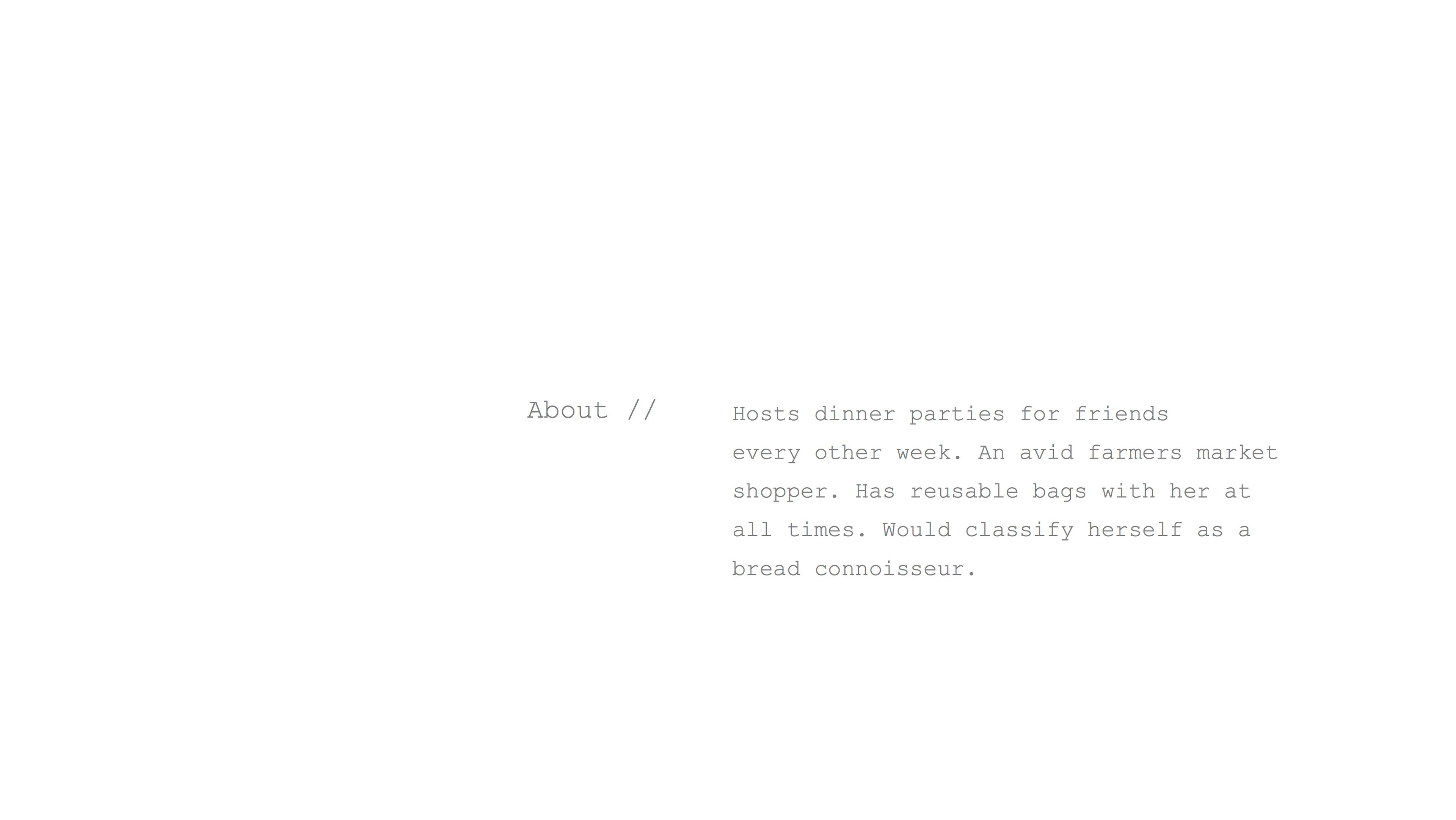
The target demographic likes to try new flavors, but wants a chance to try a trial sized bottle before committing to a full size bottle.
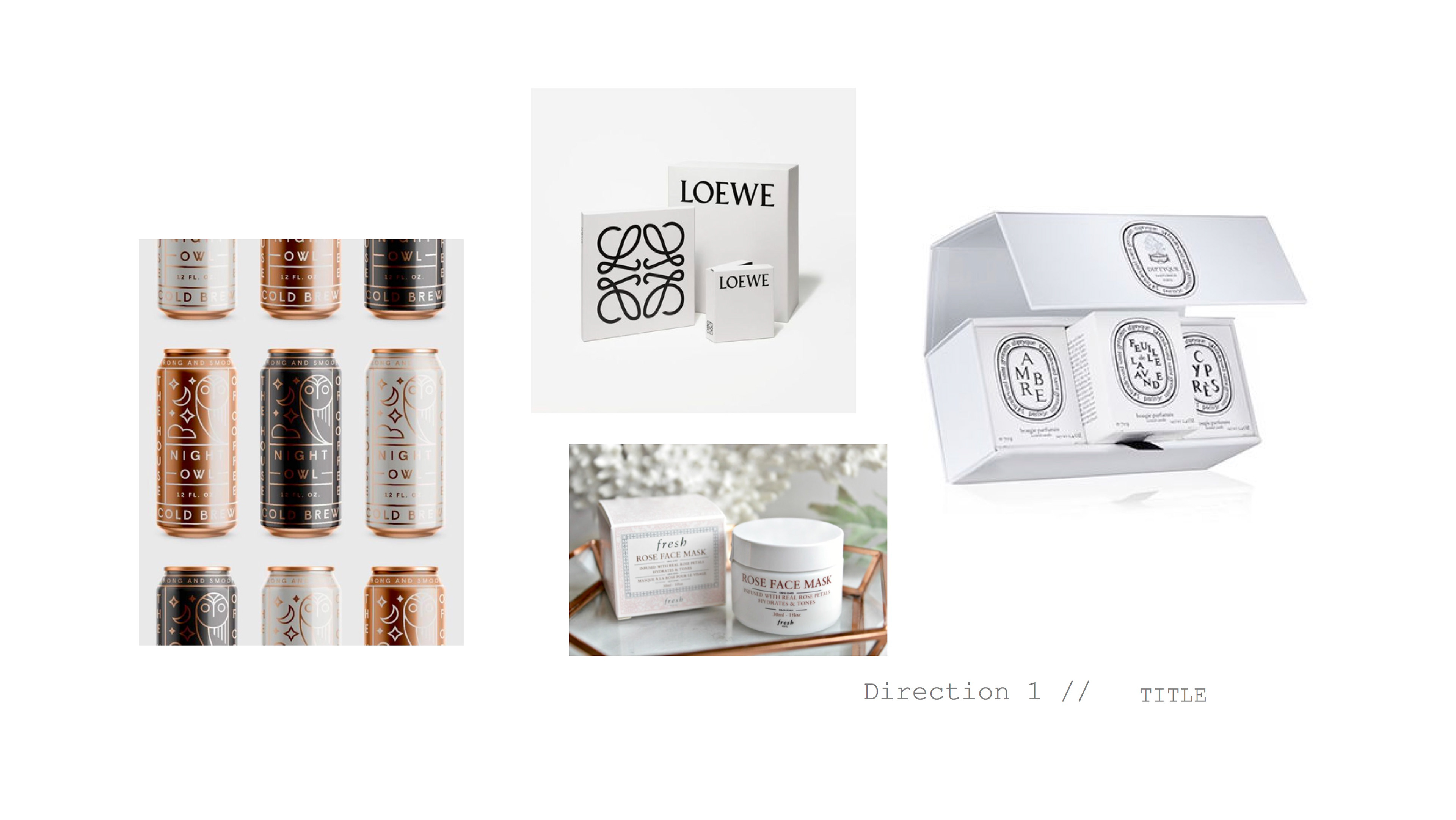
Visual Direction 1 // Sophisticated, Black and White
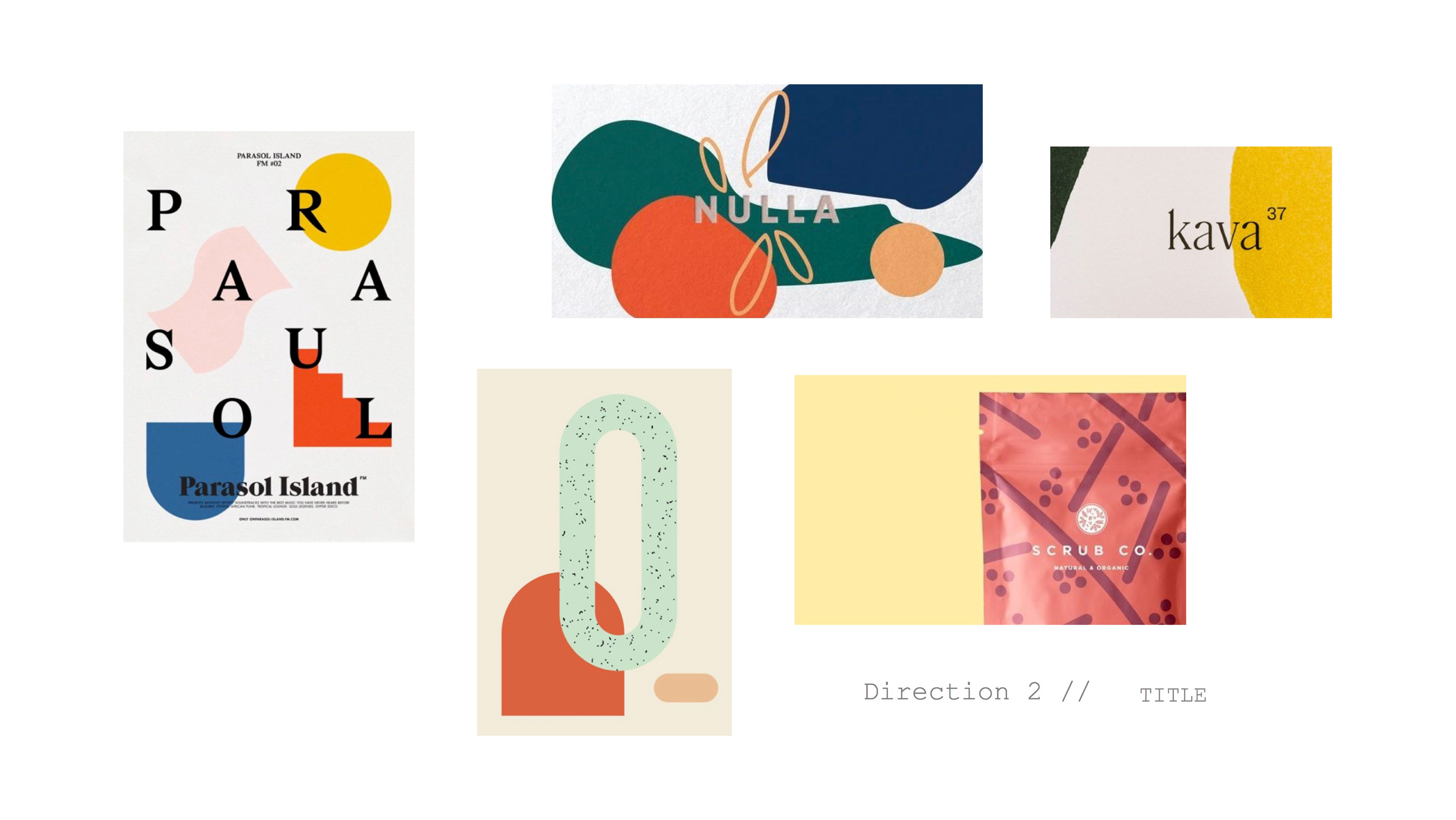
Visual Direction 2 // Colorful Organic Shapes
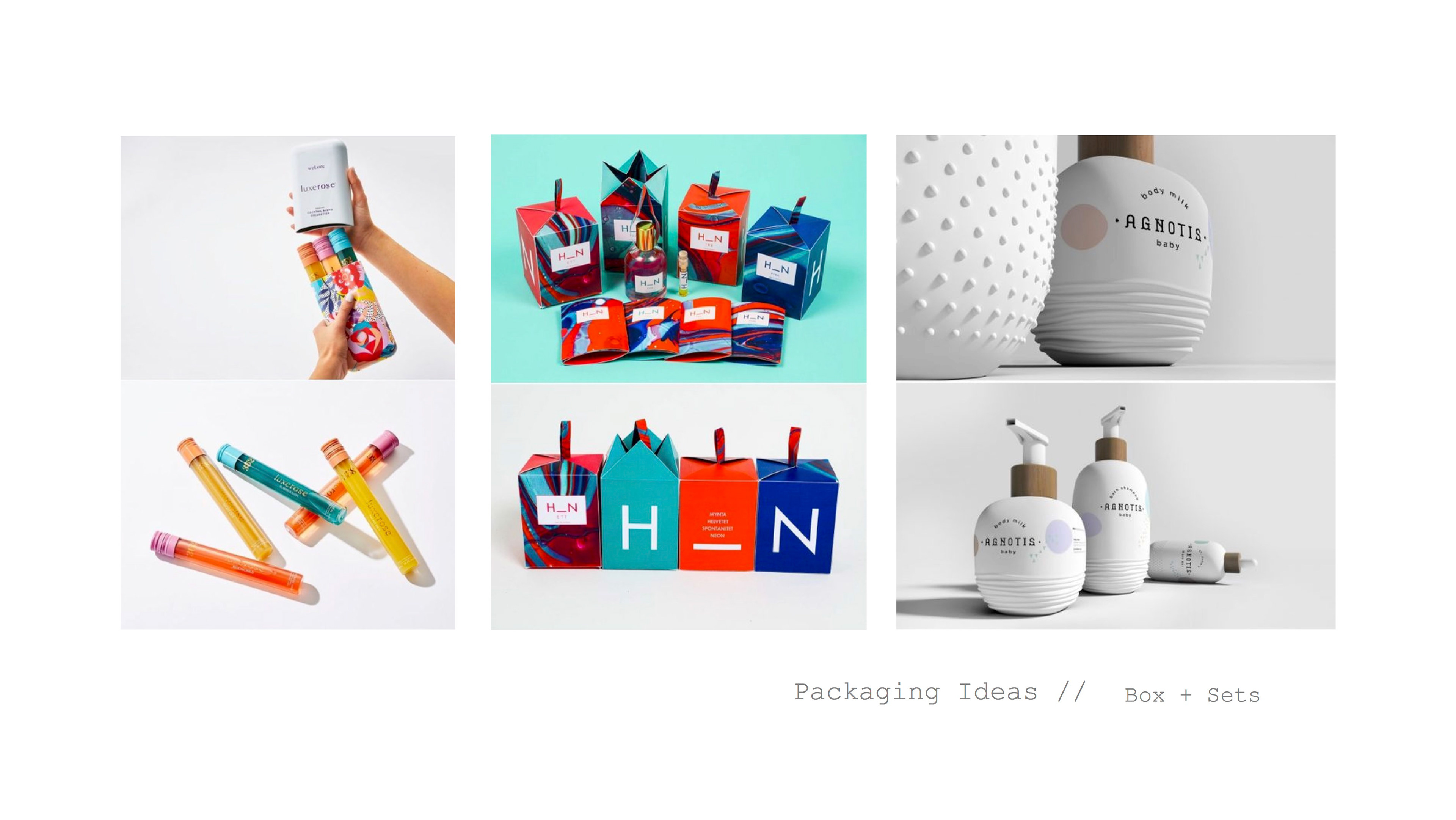
Packaging inspiration board. Looking at sets or systems of a line.
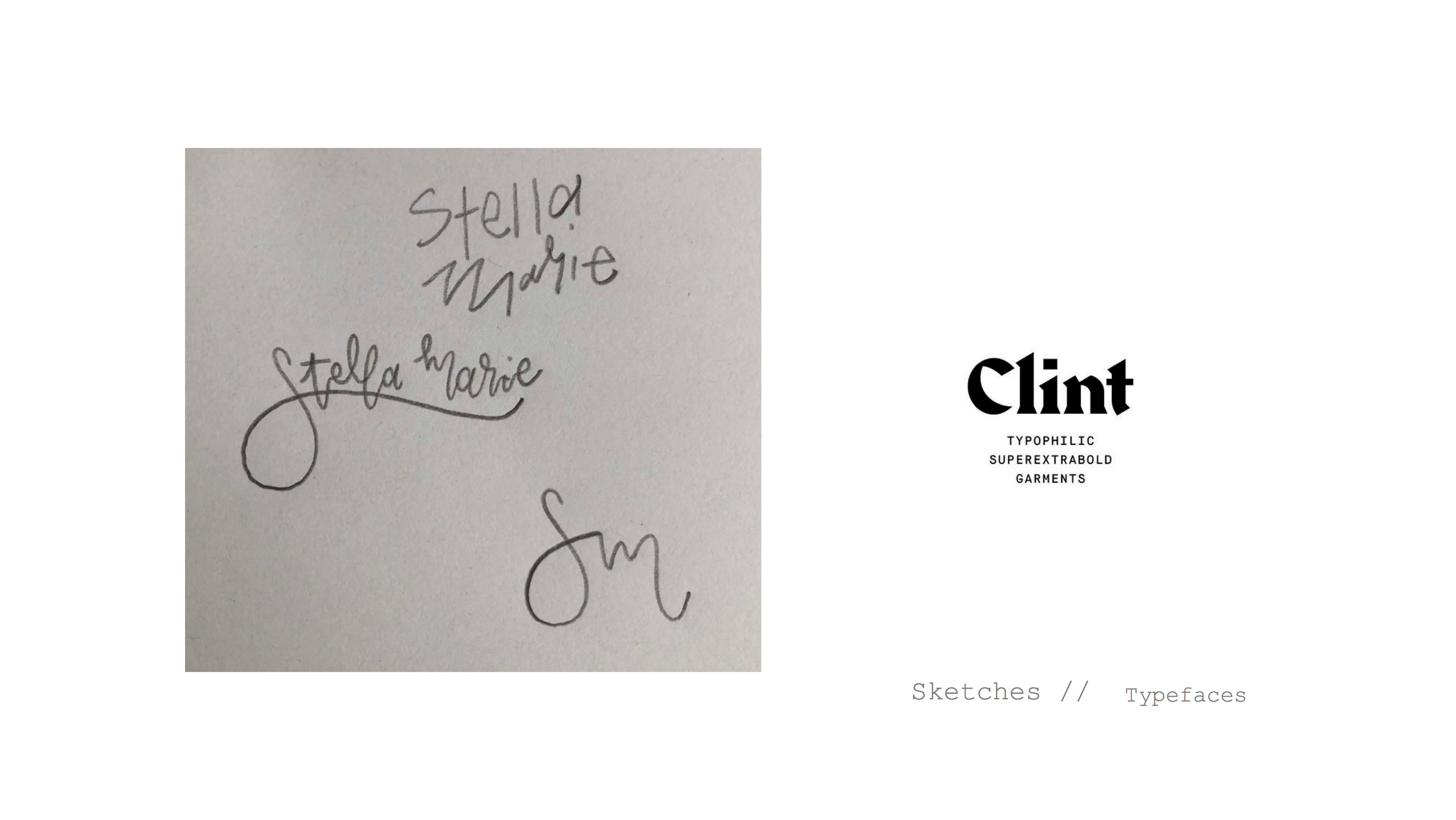
Some of my logo sketches and possible logo type option.
Before starting on any packaging rough drafts, I need to be sure of what surface I will be working with. Form influences the design due to shape, surface area, and visual real estate on each side/view point.
I went out to look at competitive product to get a sense of price, bottle shapes, net weights, sets and most of all packaging ideas (the form). Below are some photos of competitive product.
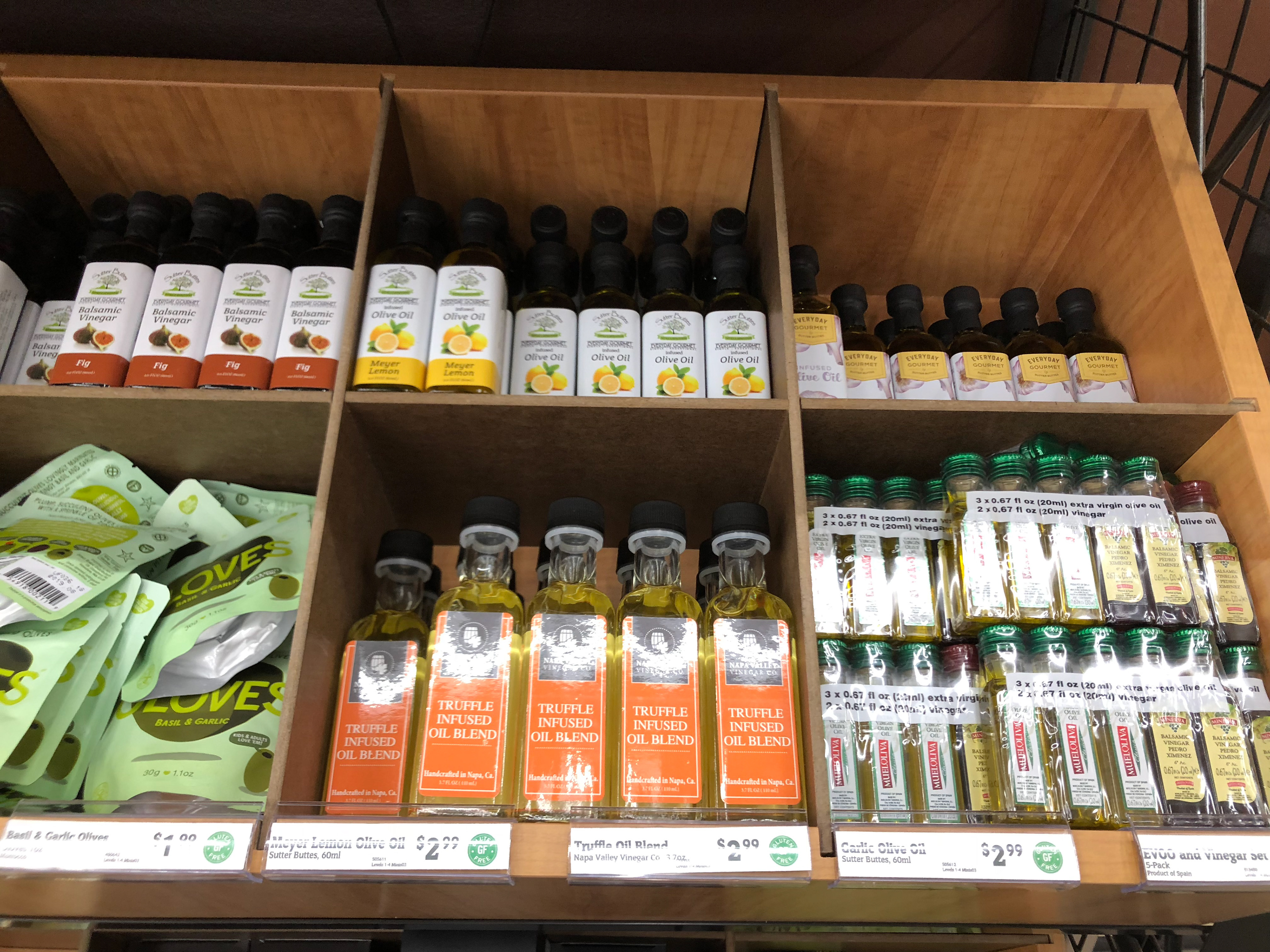
Small sample size oil bottles.
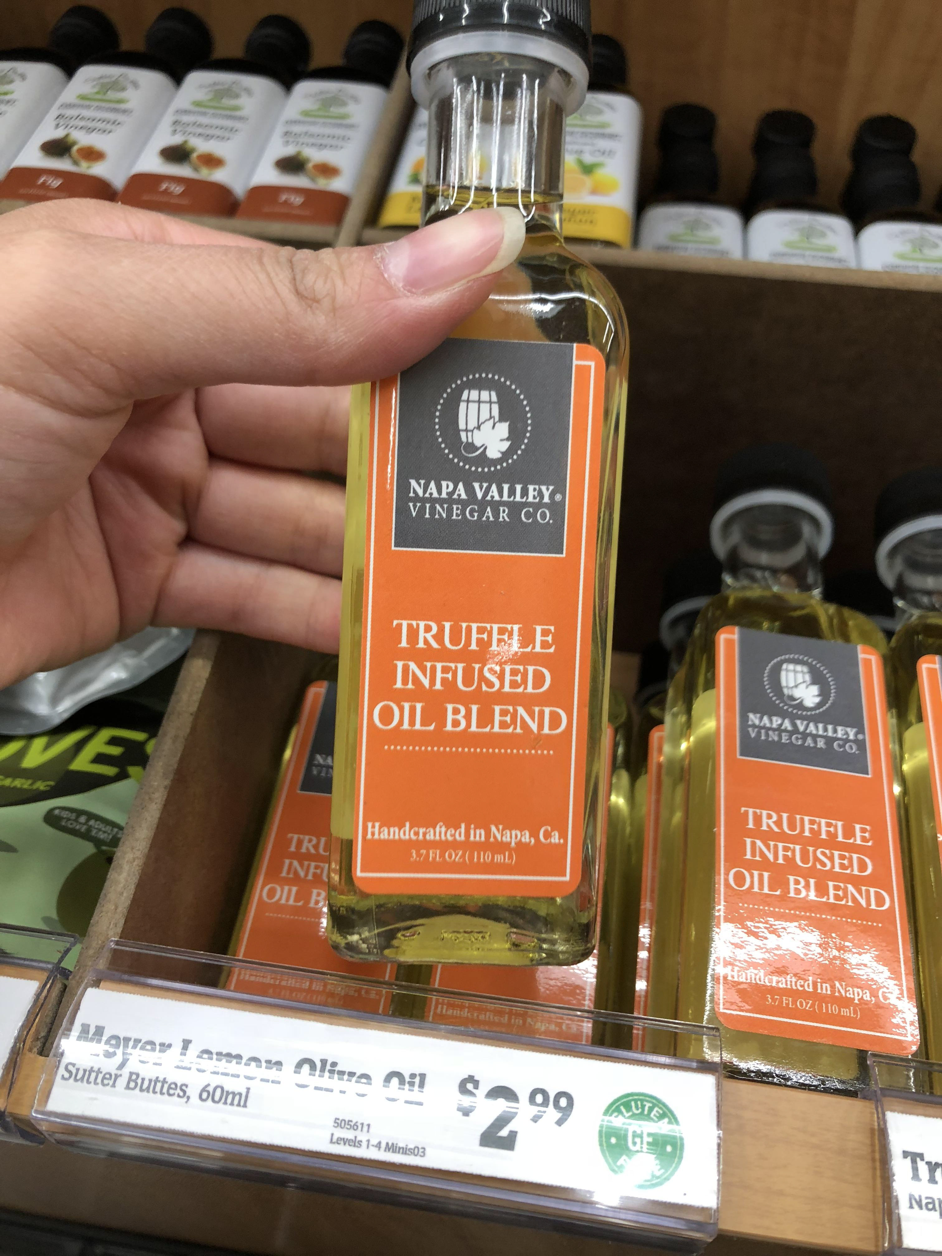
Closer look at sampler oil.
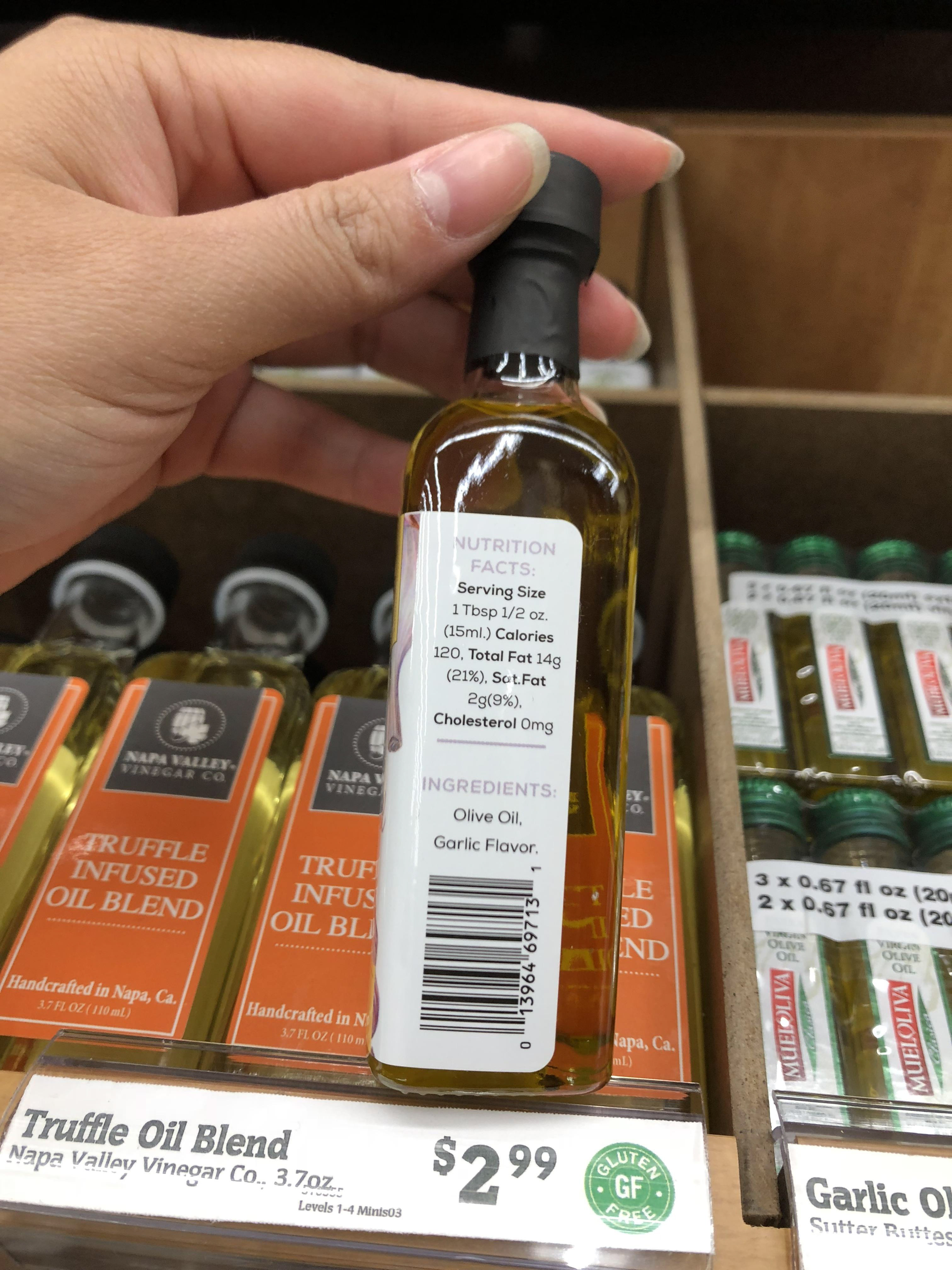
Looking at how they fit all the information on such a small surface area.
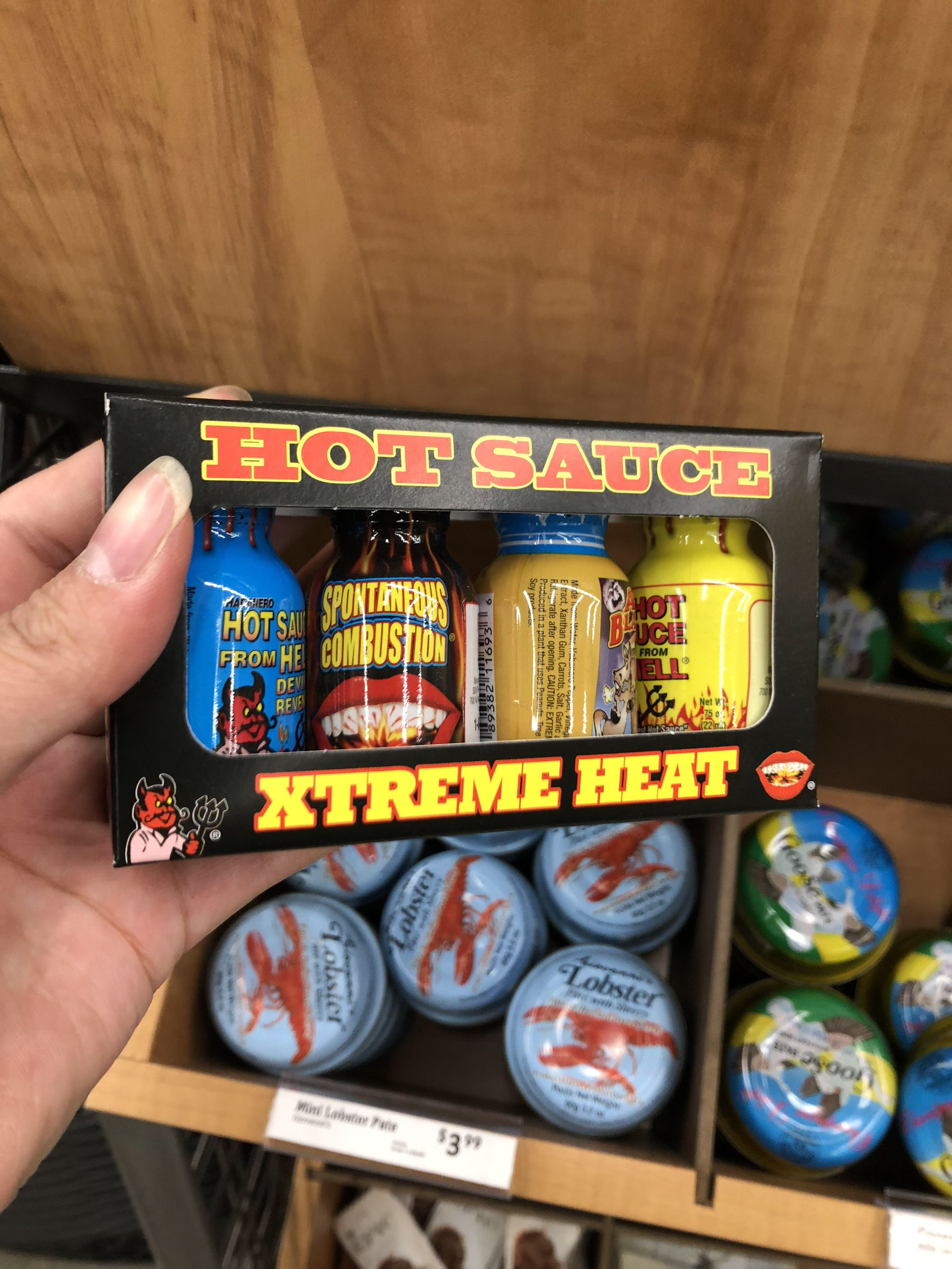
Looking at boxed sets.
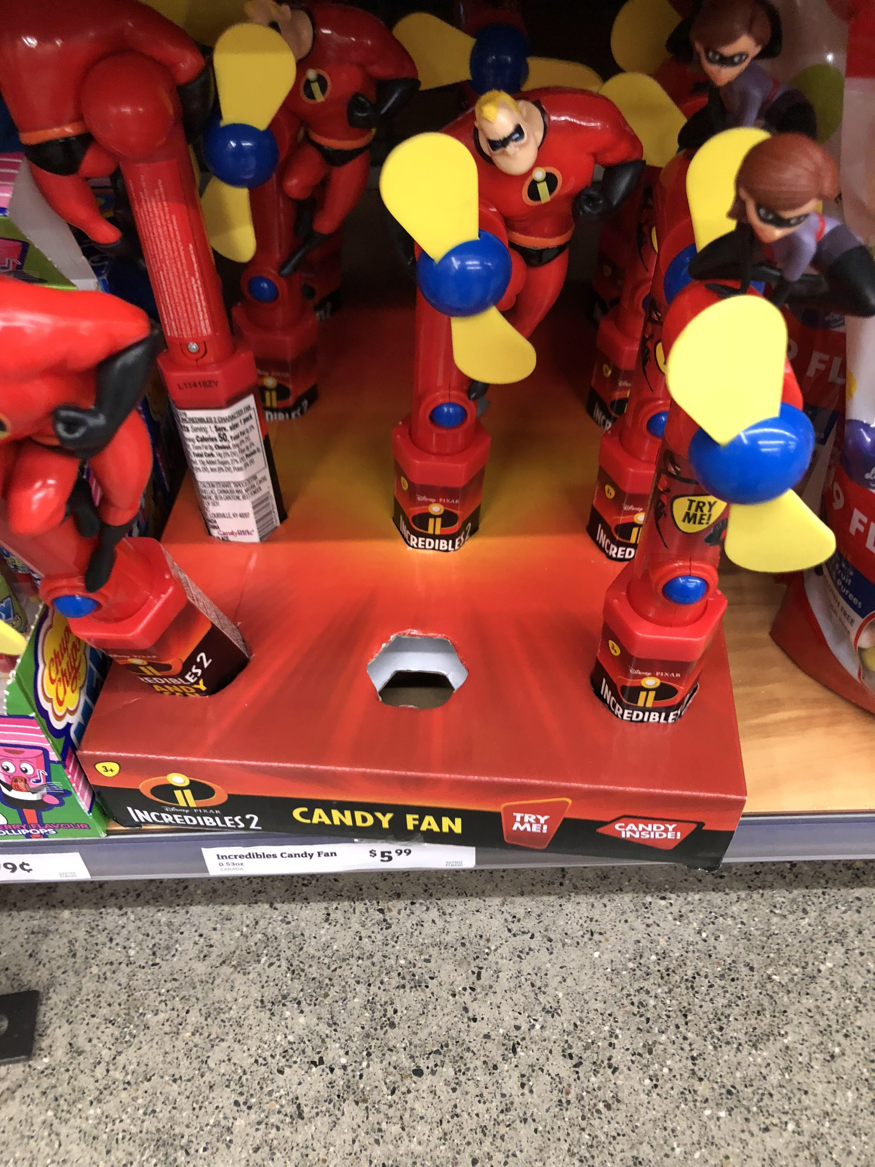
Shelf display for longer forms.
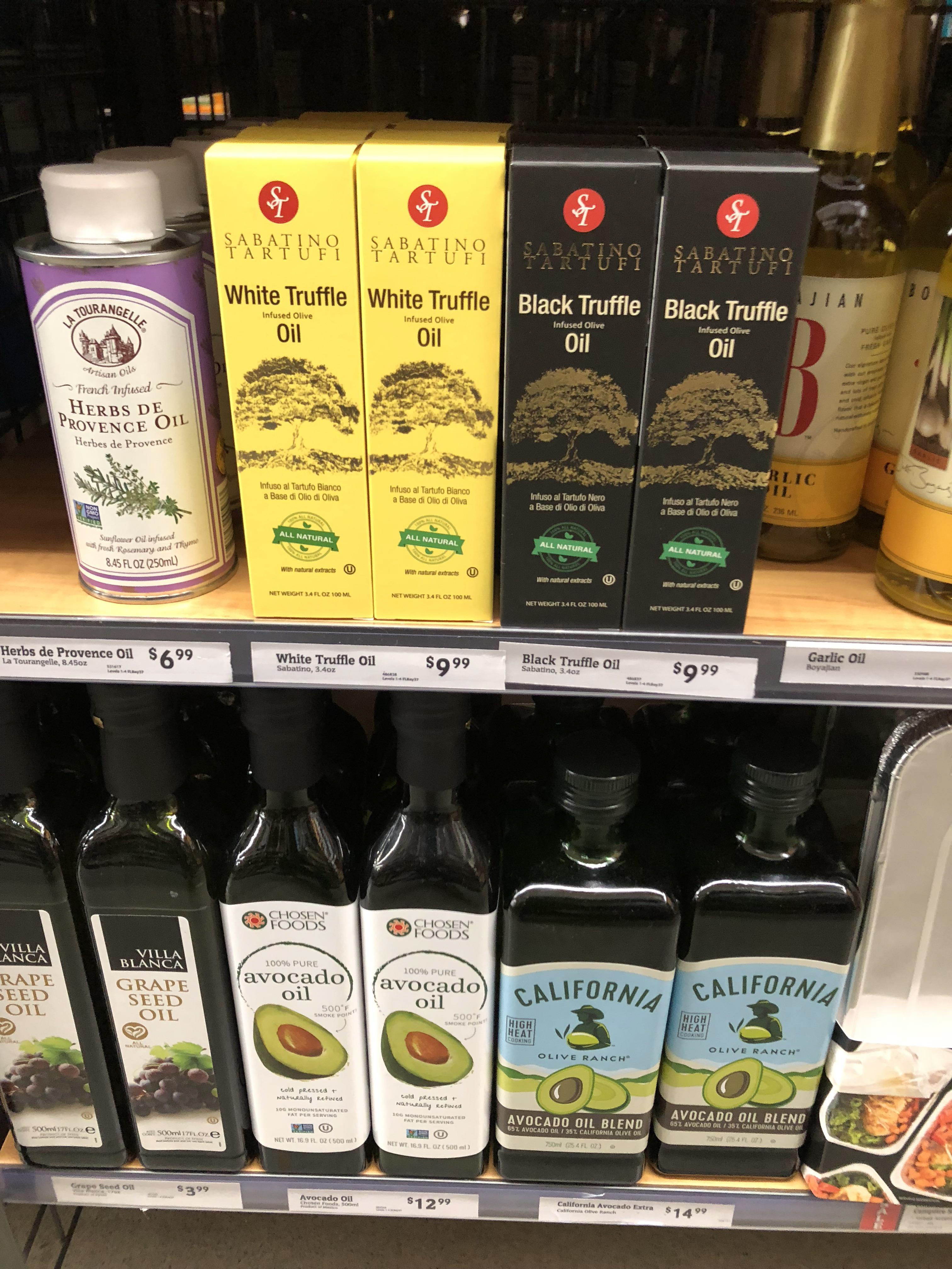
Olive oil packaging in different packaging forms.
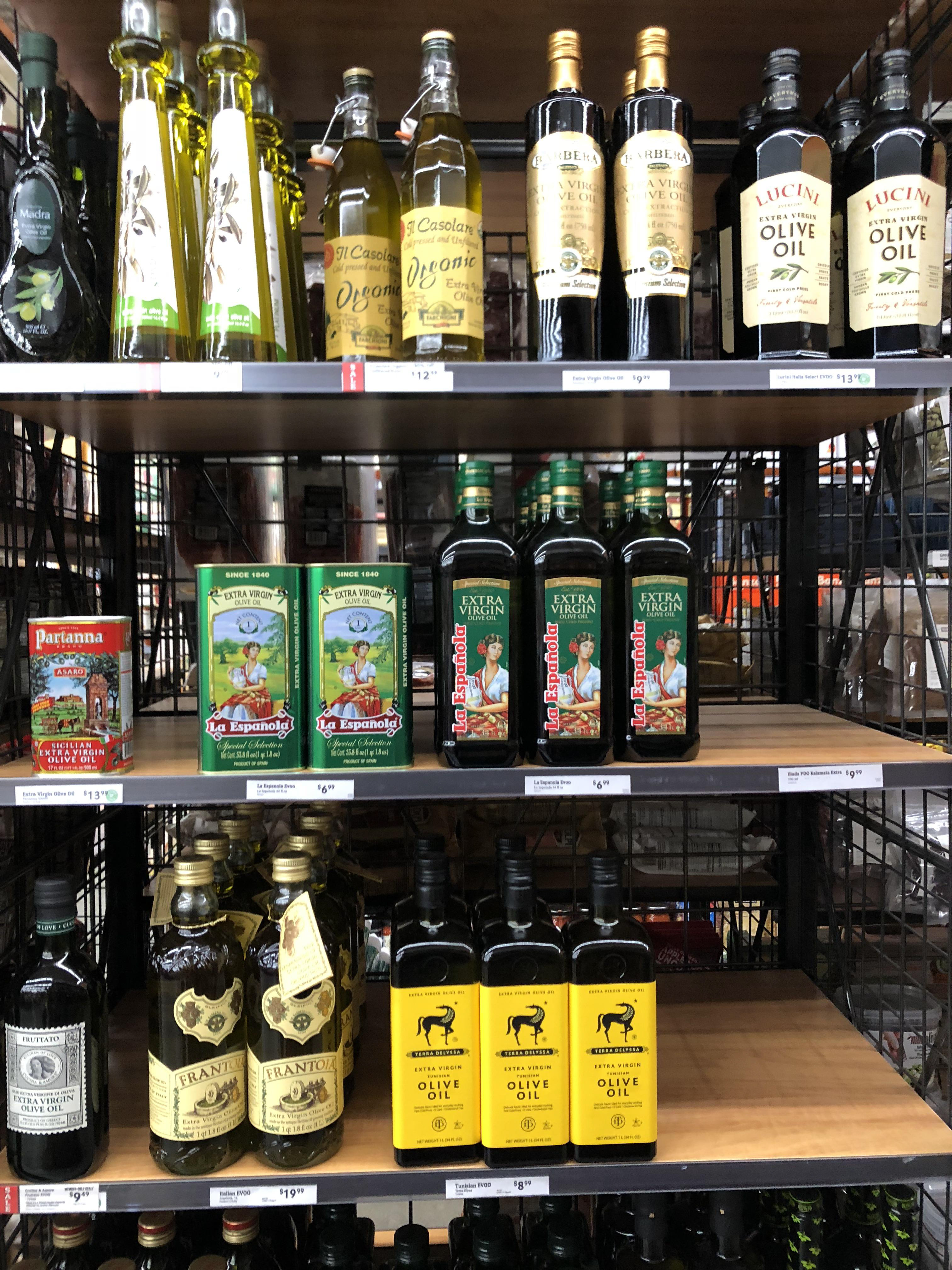
More packaging forms.
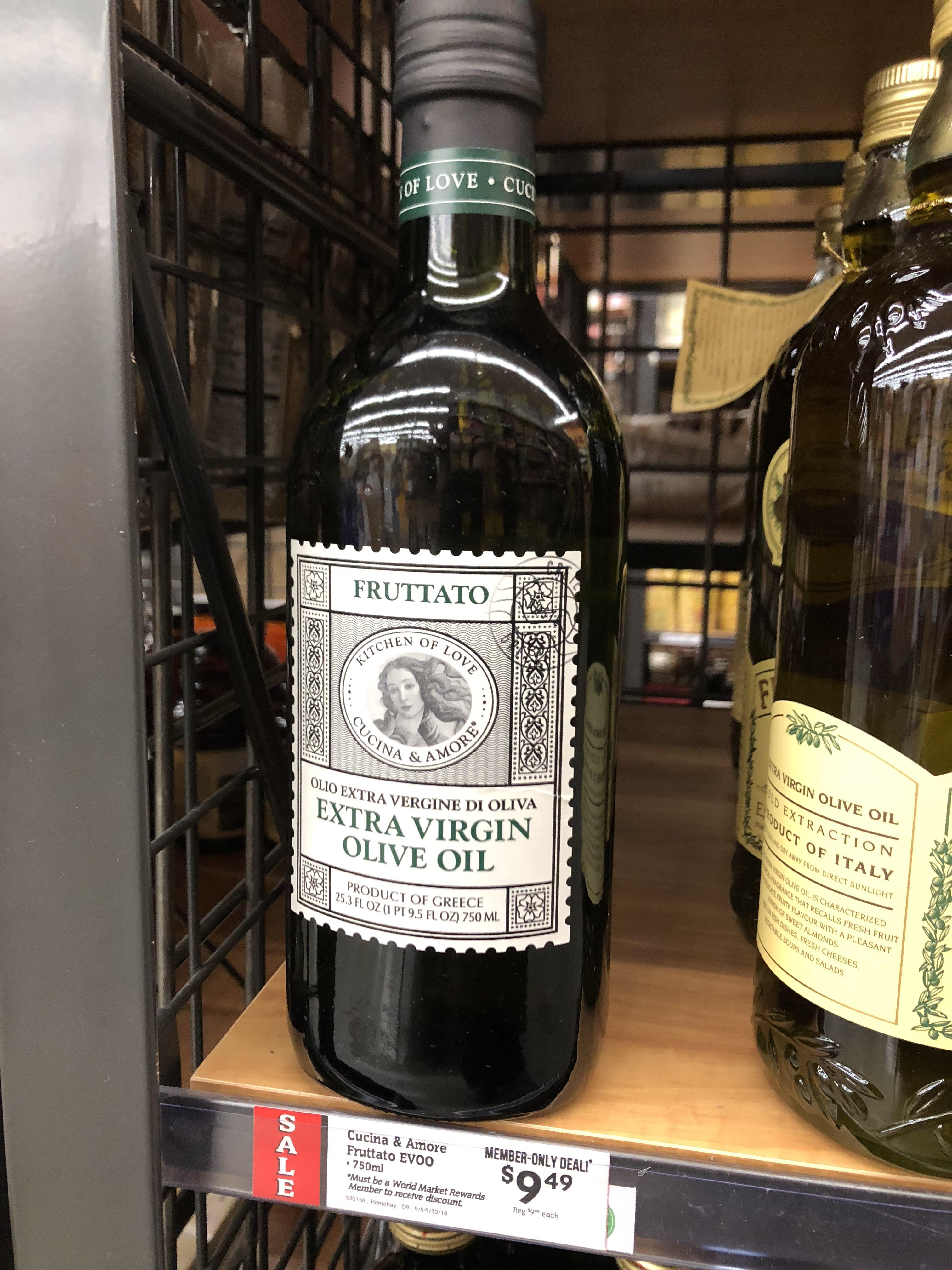
Classic form, humanistic form.
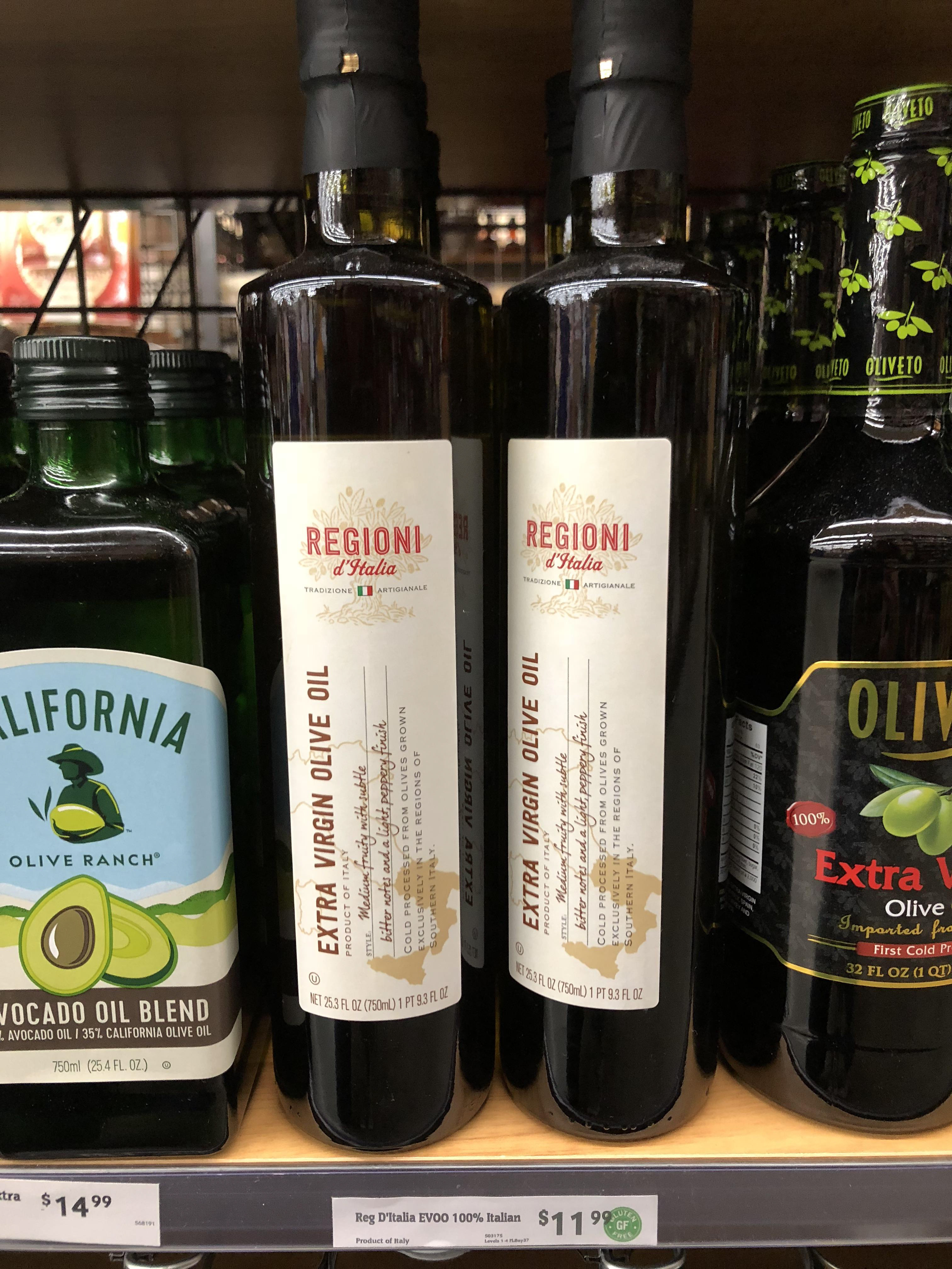
Modern form.
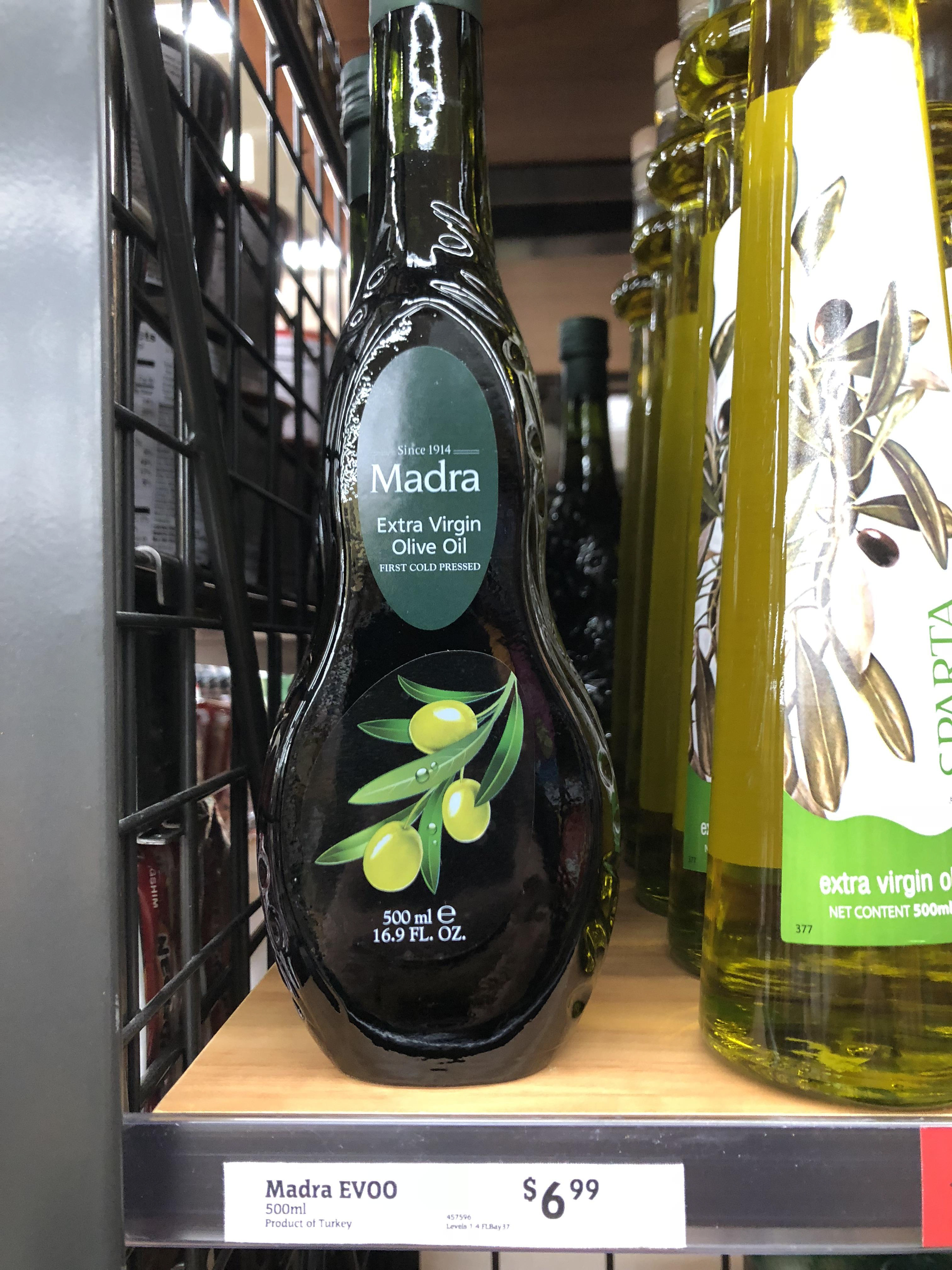
Unique bottle shape.
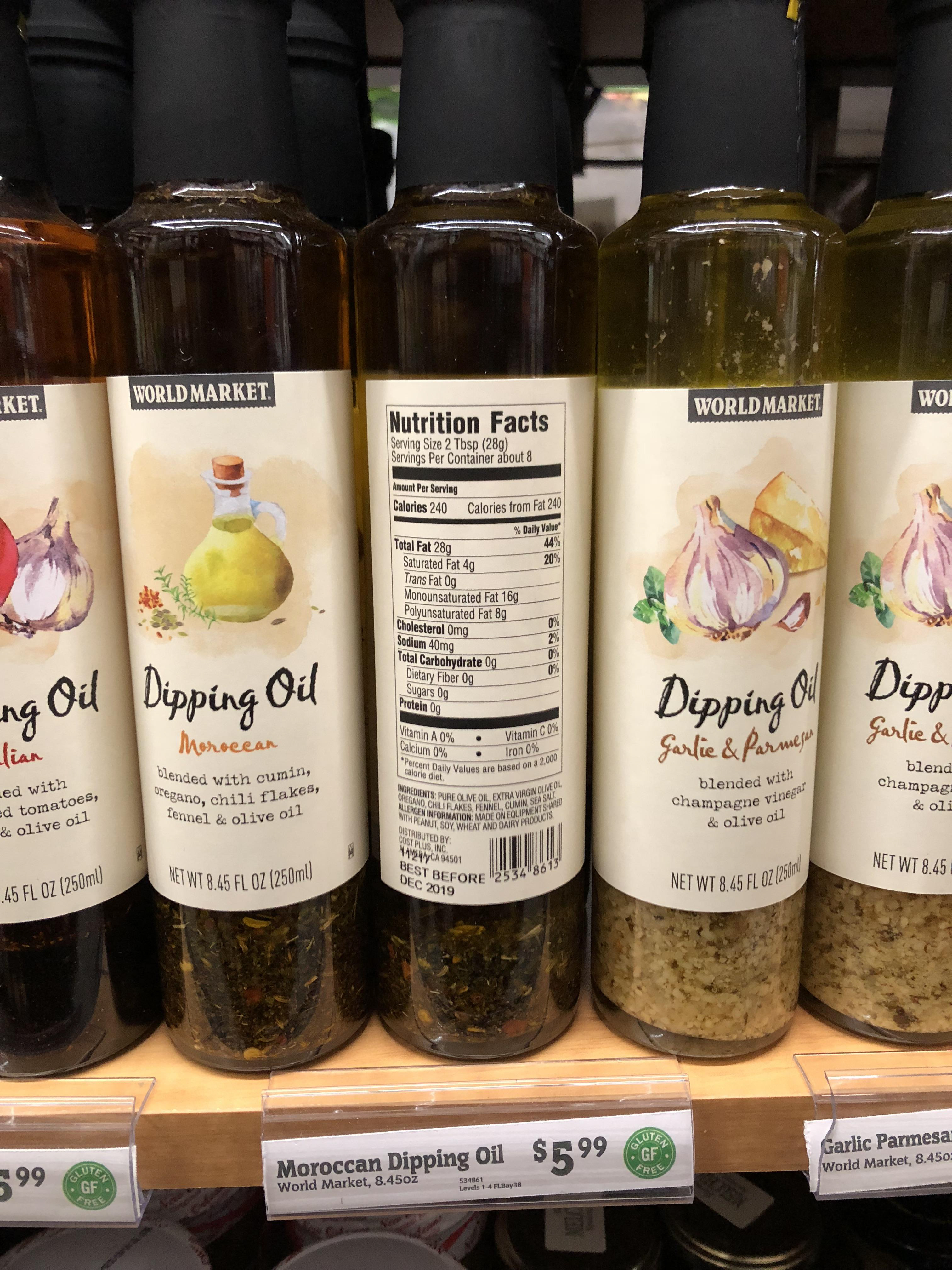
Modern form with many flavors. Looking at a line of oils and how they function together on the shelf. Paying attention to net weight, common flavors and nutrition facts.
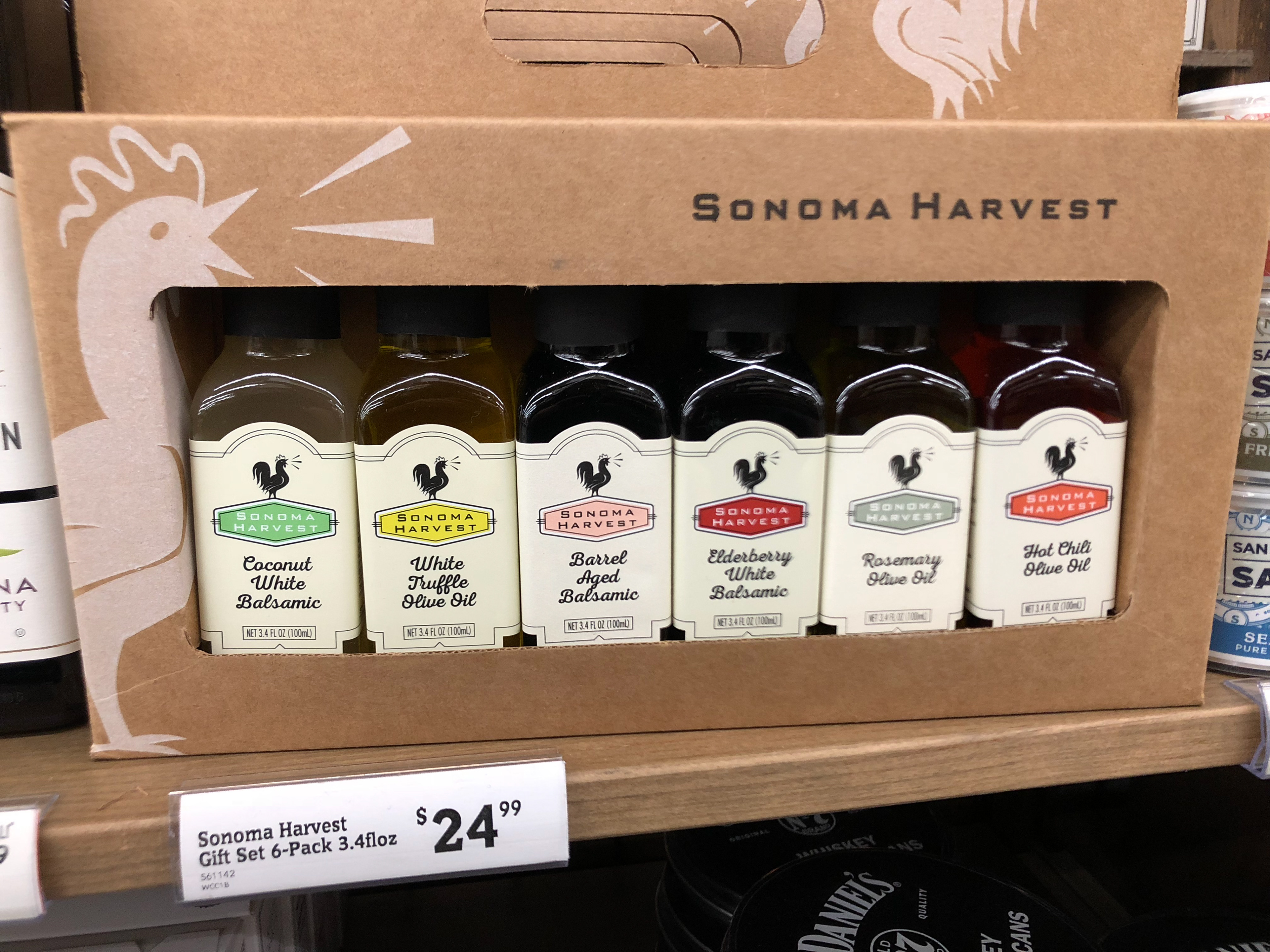
Sample pack.
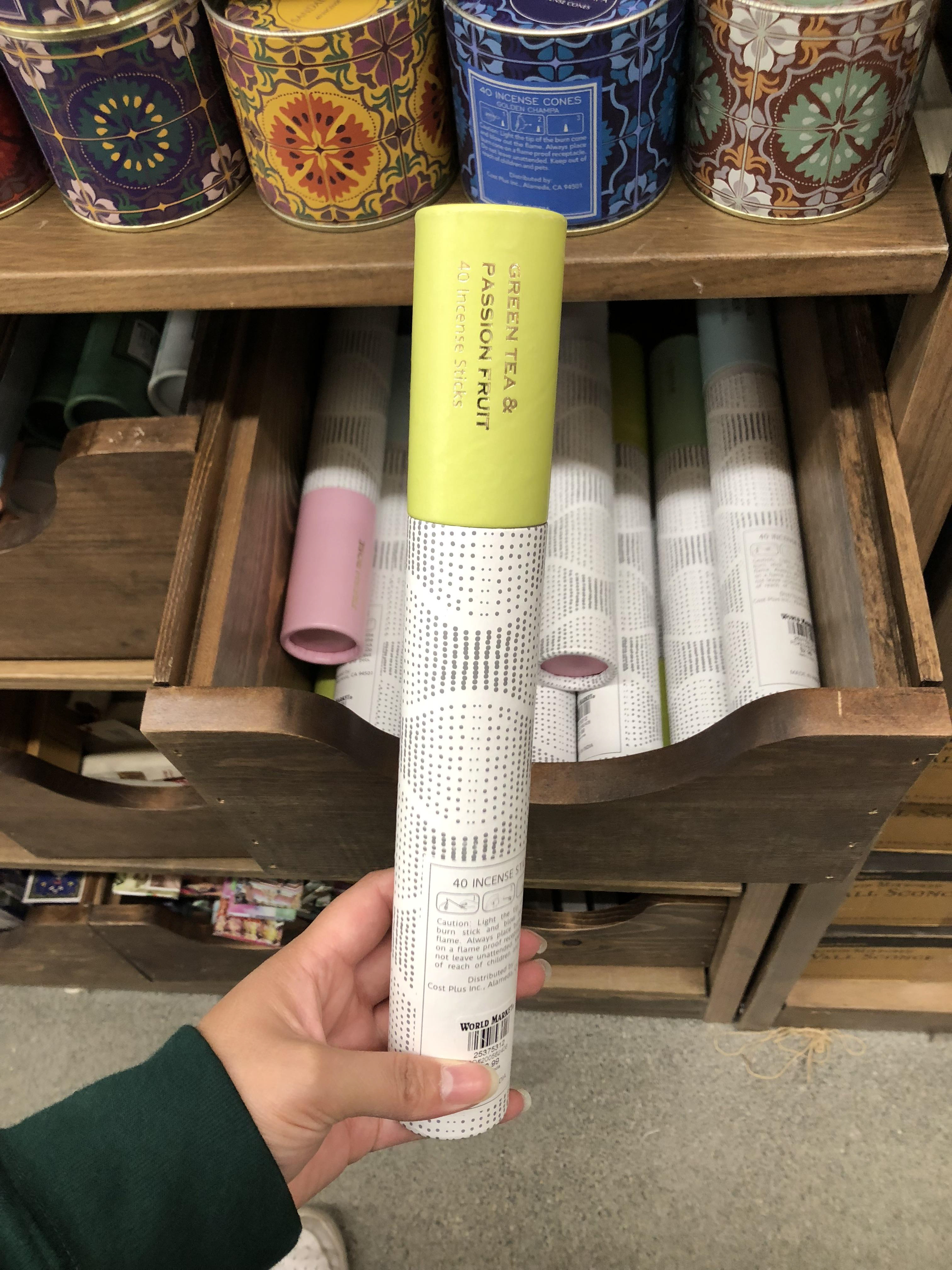
The form I used to create the outer packaging for my oil. This was a kraft paper tube for incense sticks.
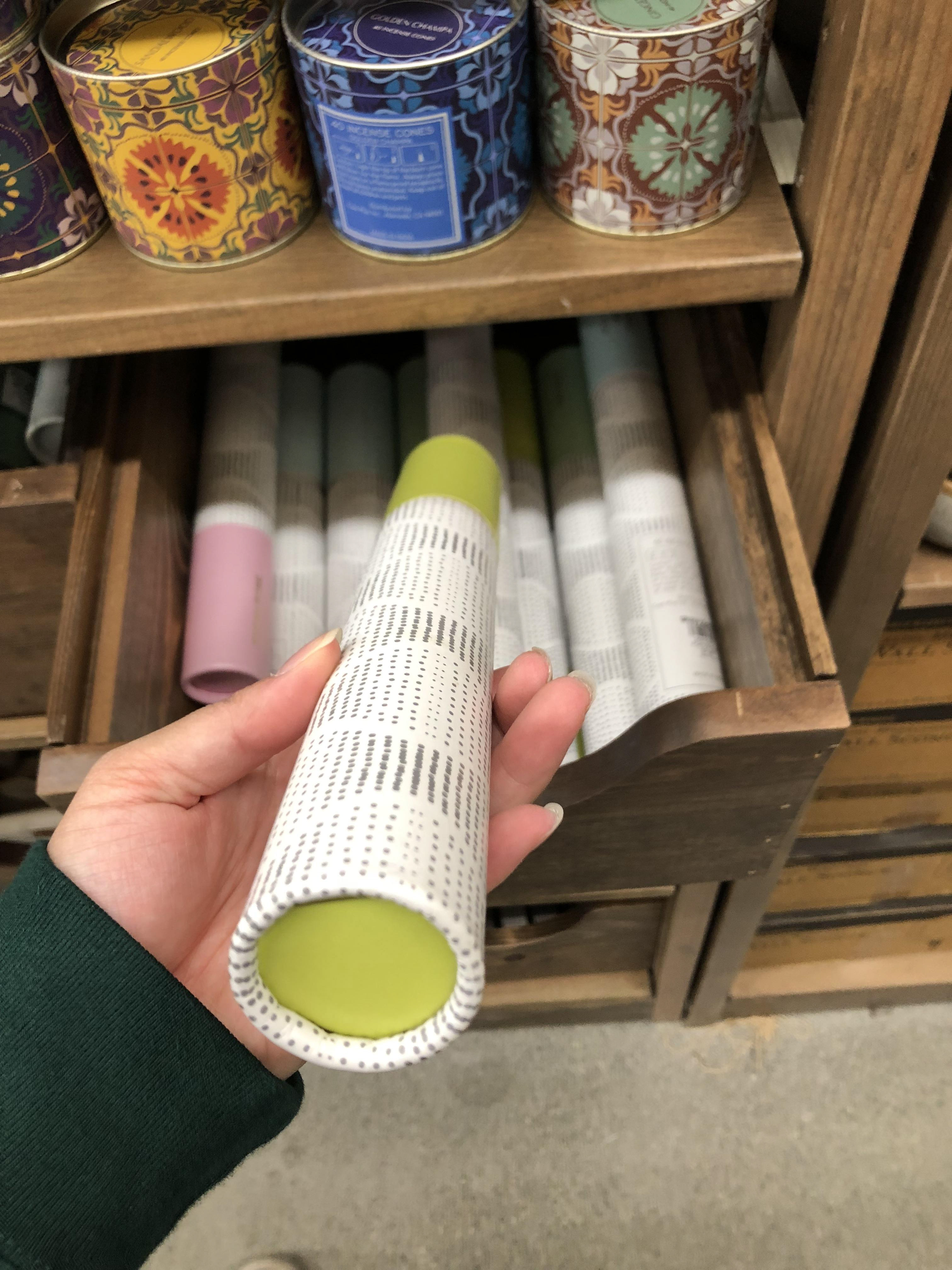
Looking at how this uses every surface to indicate scent differentiation.
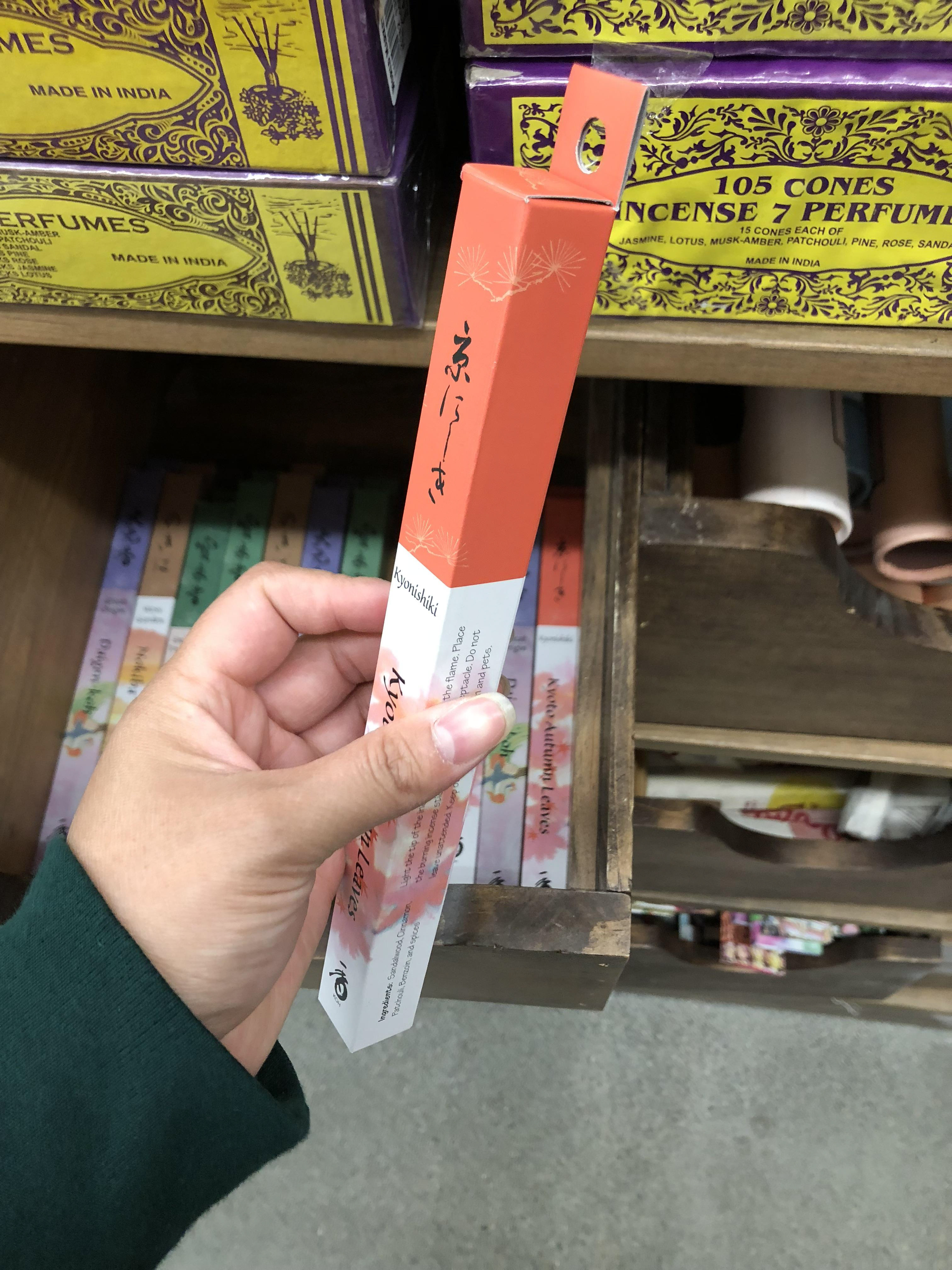
Hanging packaging.
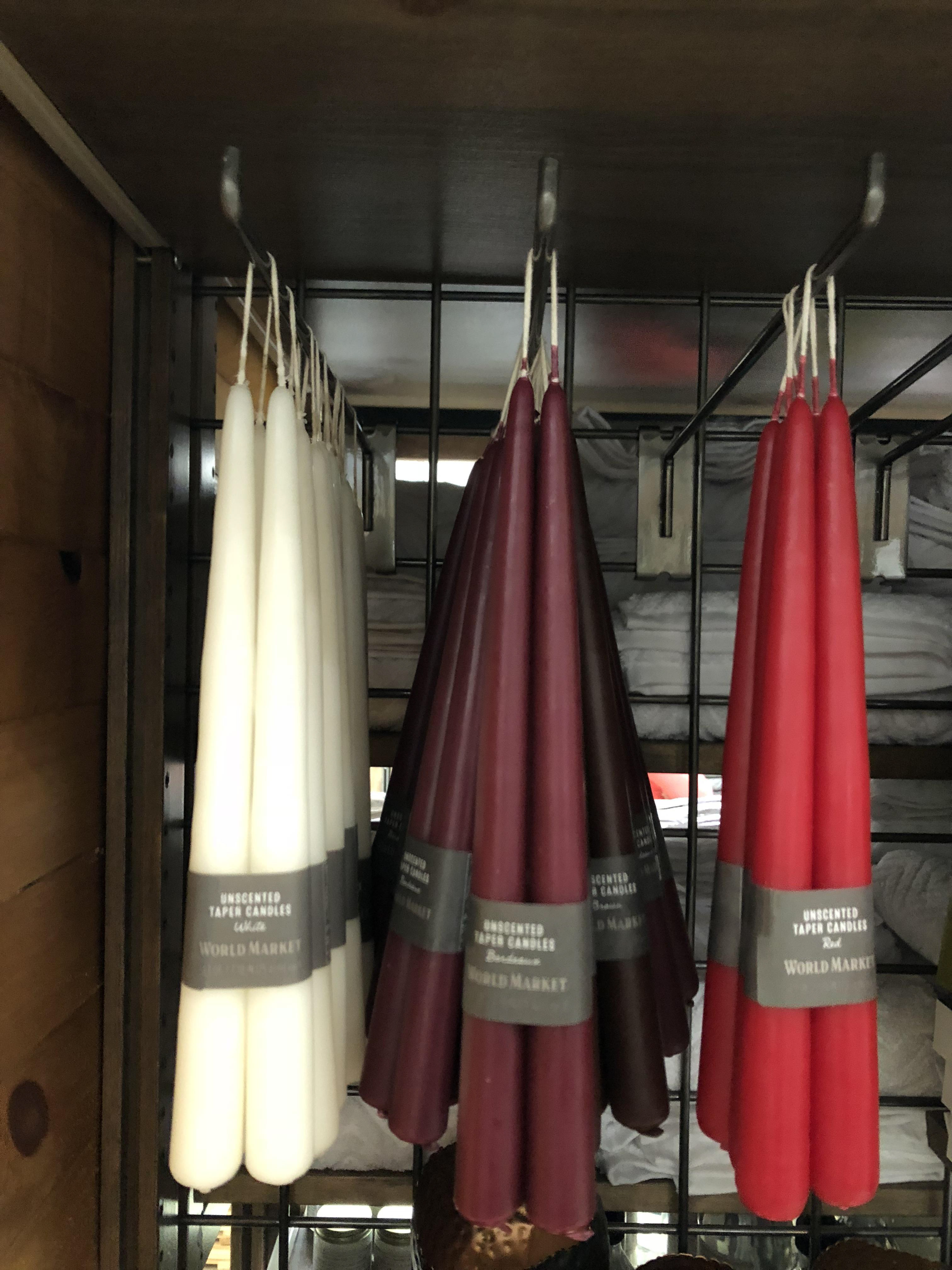
More hanging packaging.
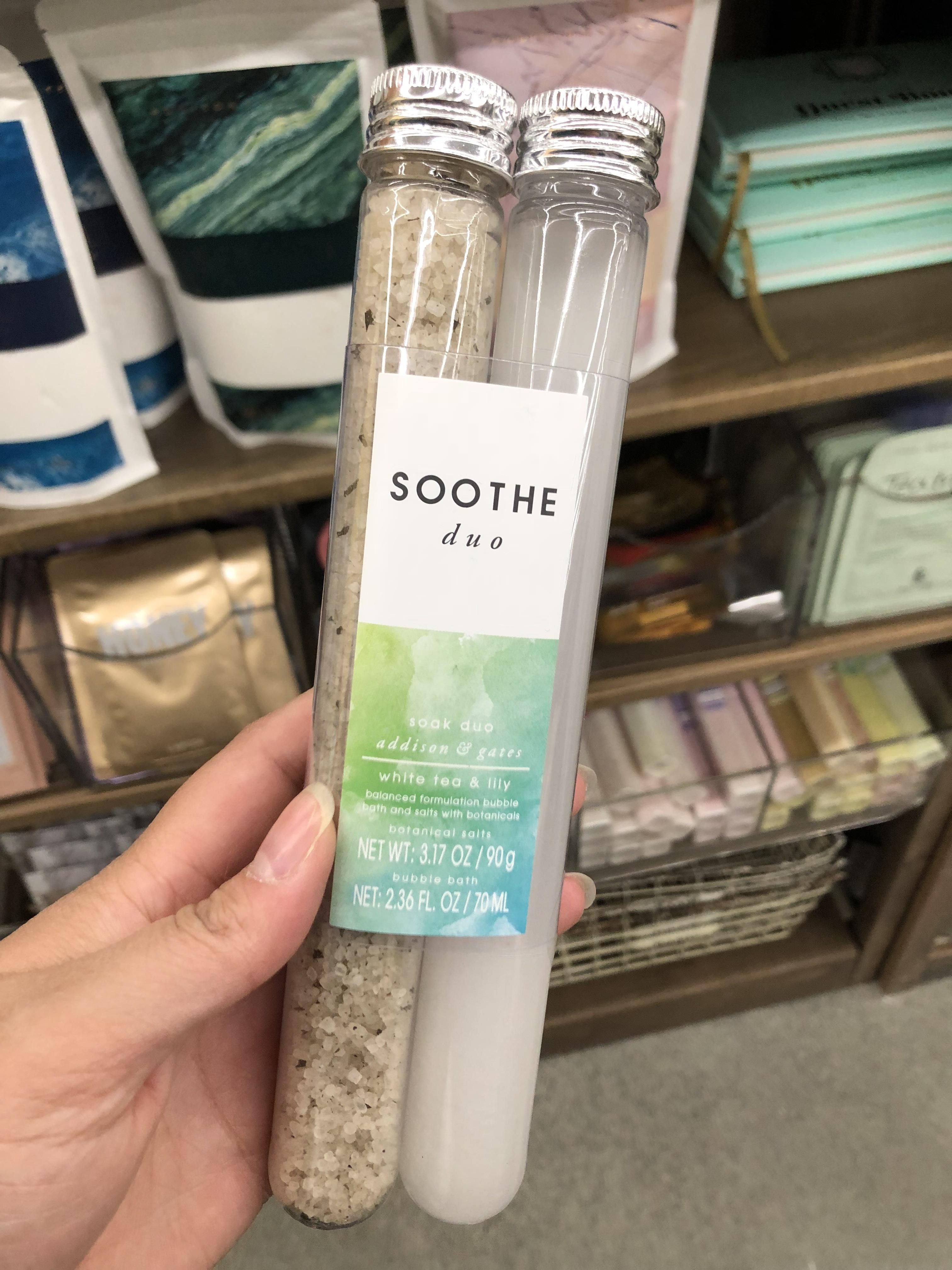
Dual tube packaging set.
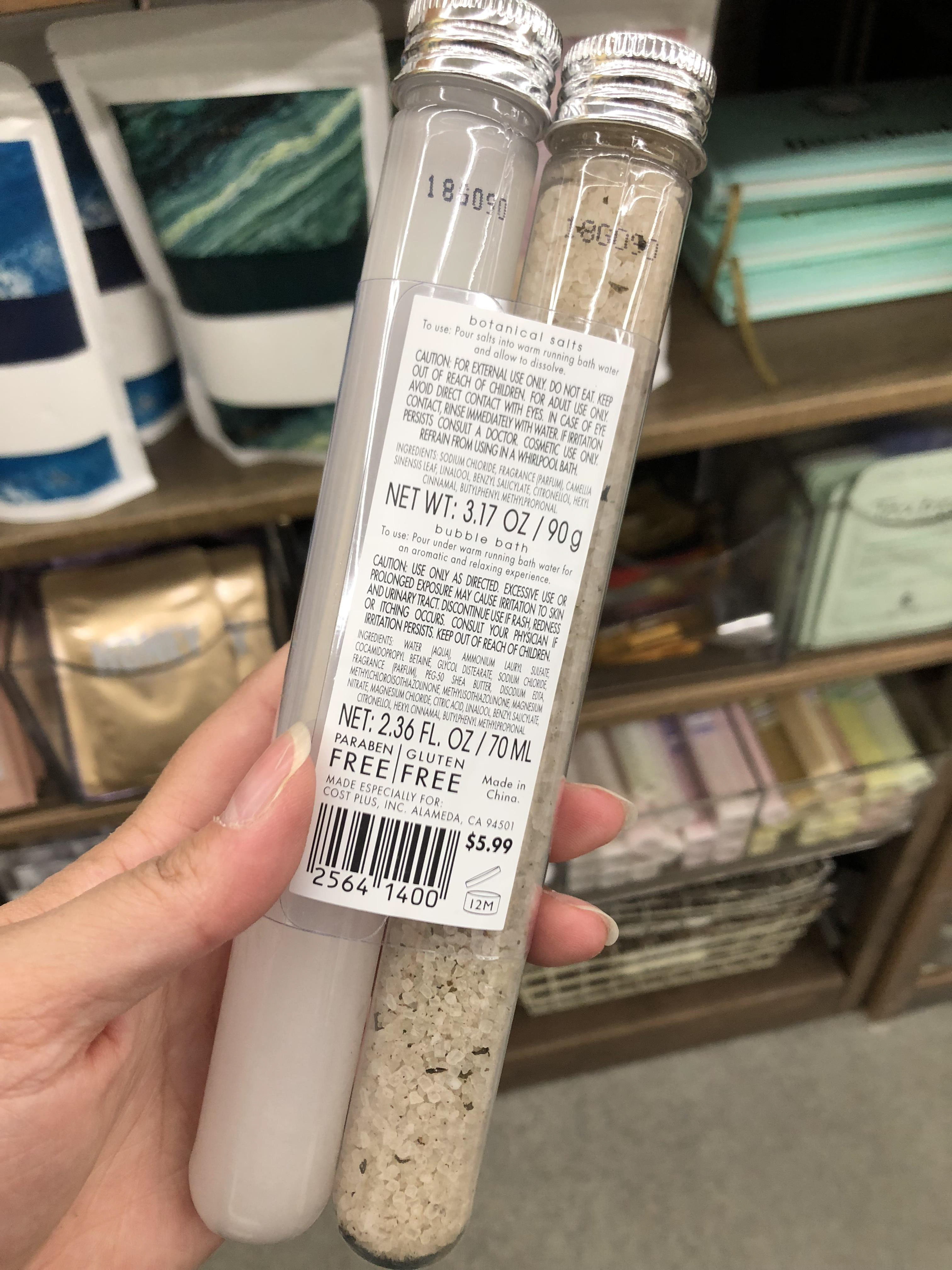
Net weight.
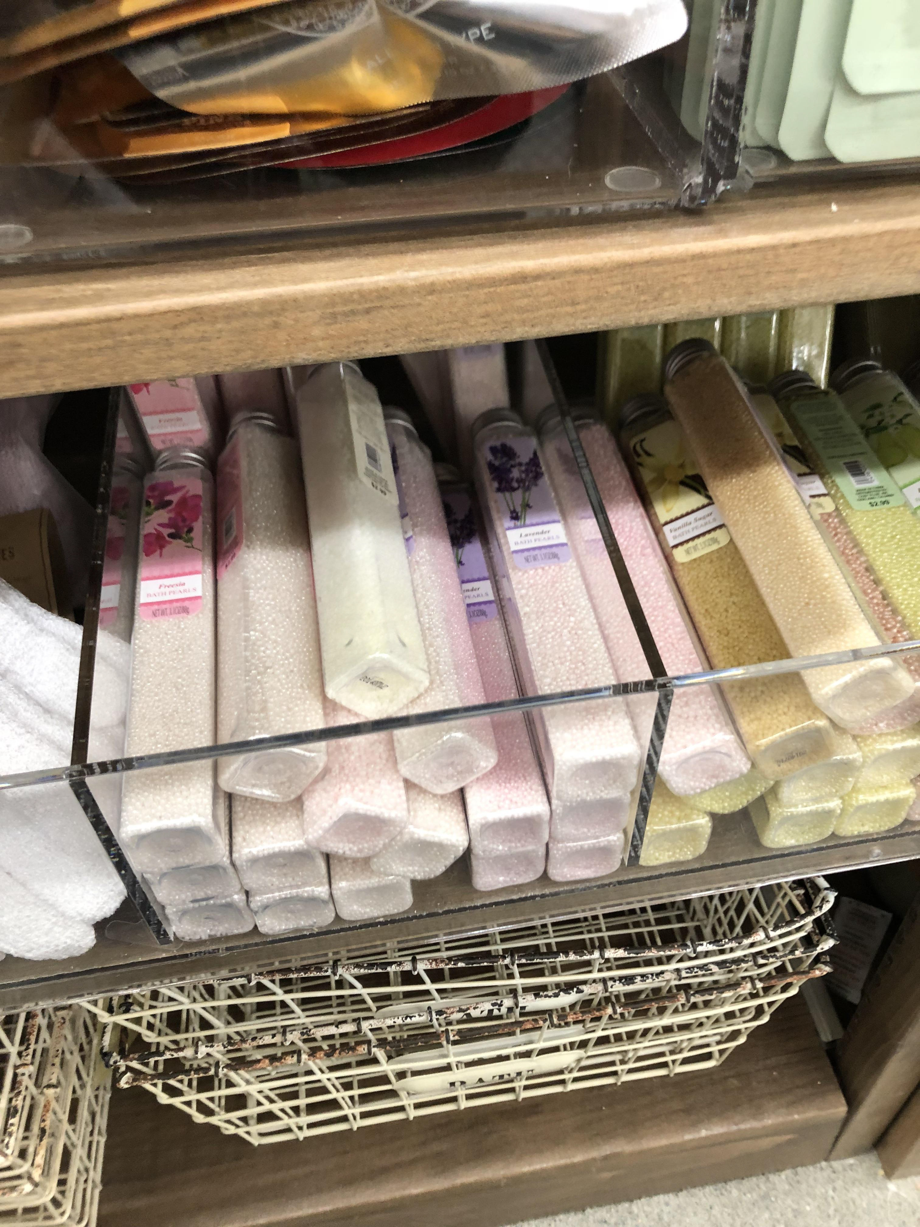
Long form store display on shelf.
Making Process
A working process of how I mocked up the packaging which includes the outer container downsize, labels, vinyl application on glass and more.
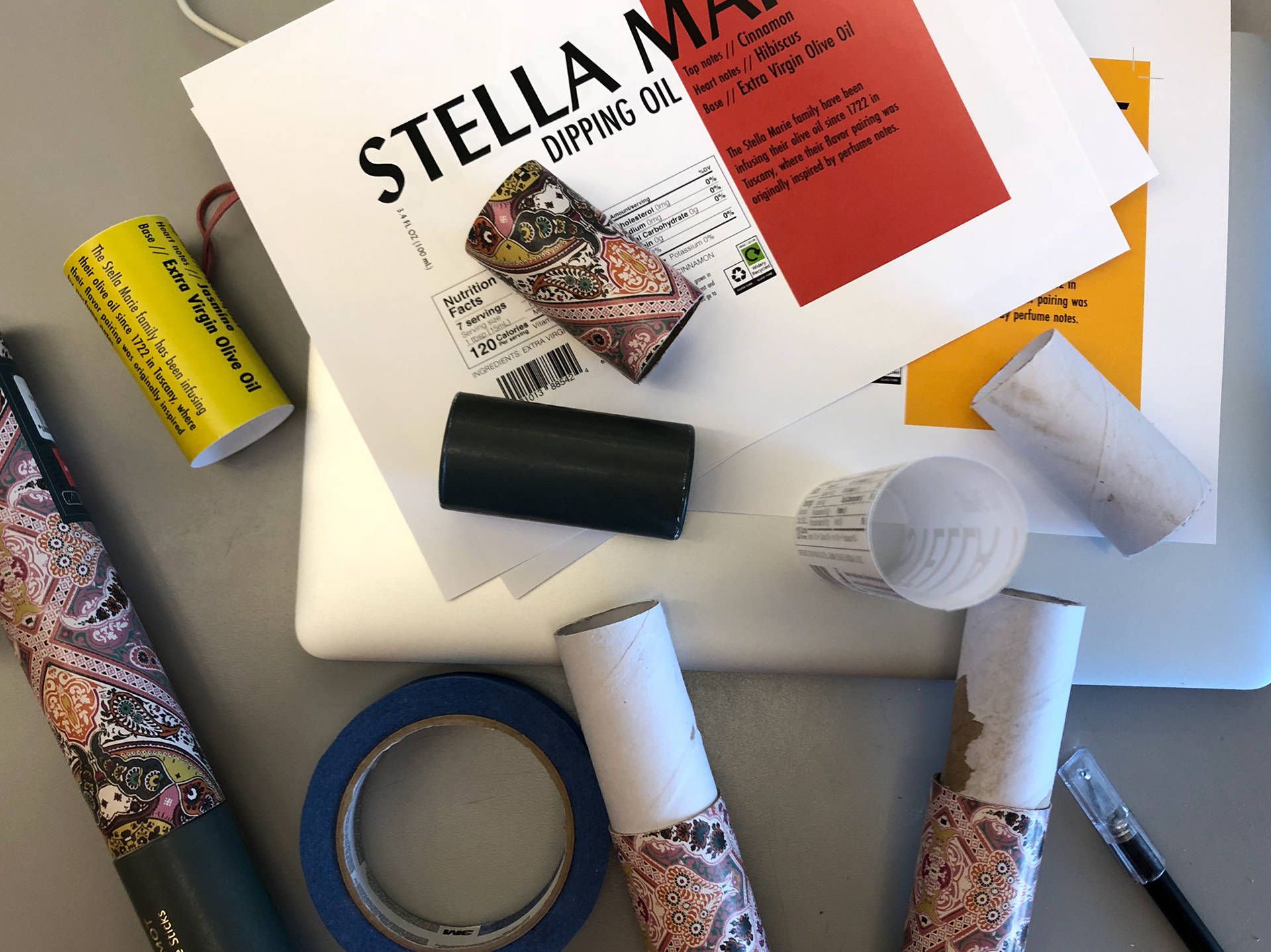
Cutting the original outer form to fit the height of the glass bottle perfectly and to reduce the amount of movement inside. I had to score the inner layer and the upper layer to fit the lip to the lid.
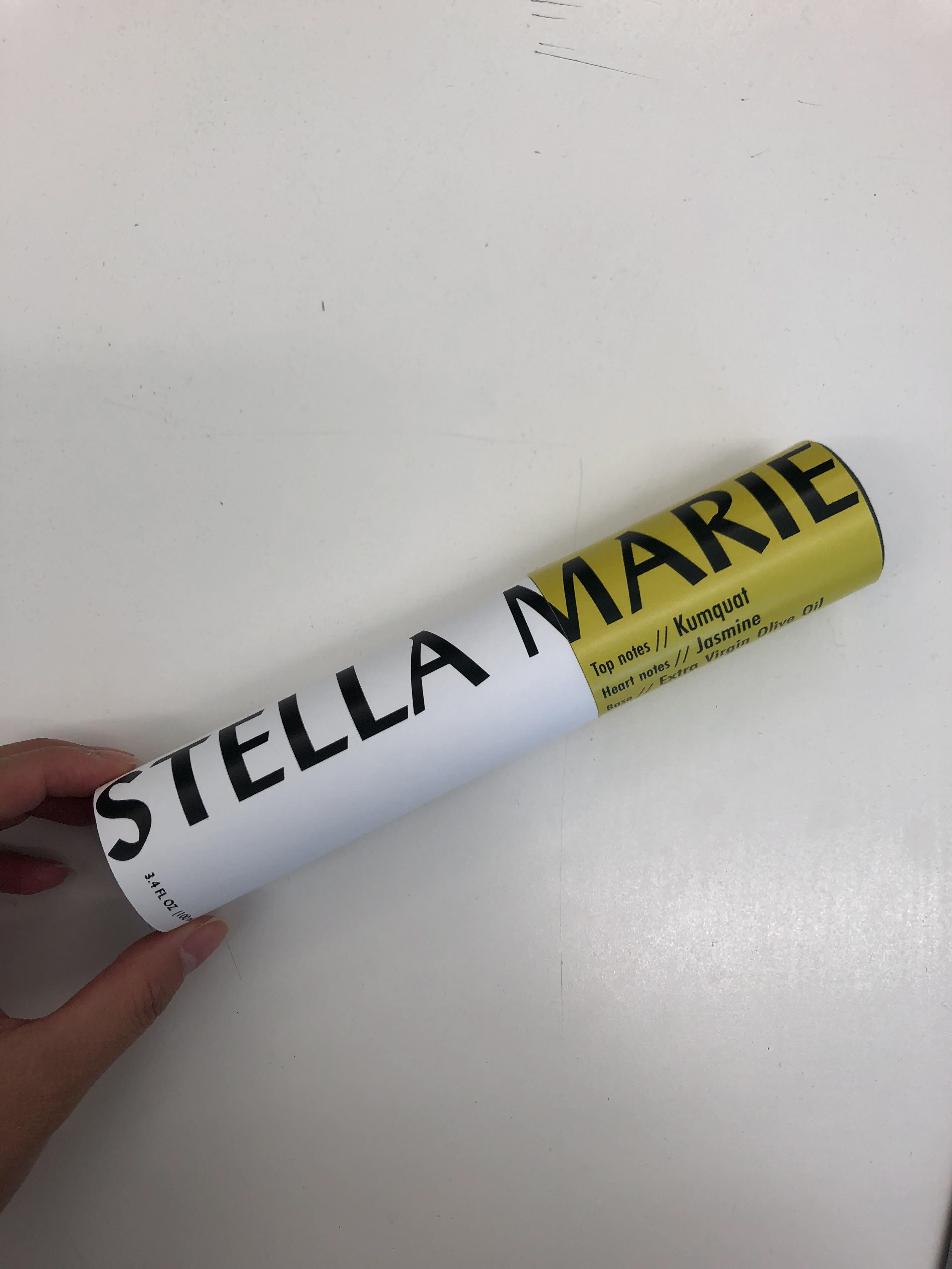
First draft wrapped on form to see gaps and spacing.
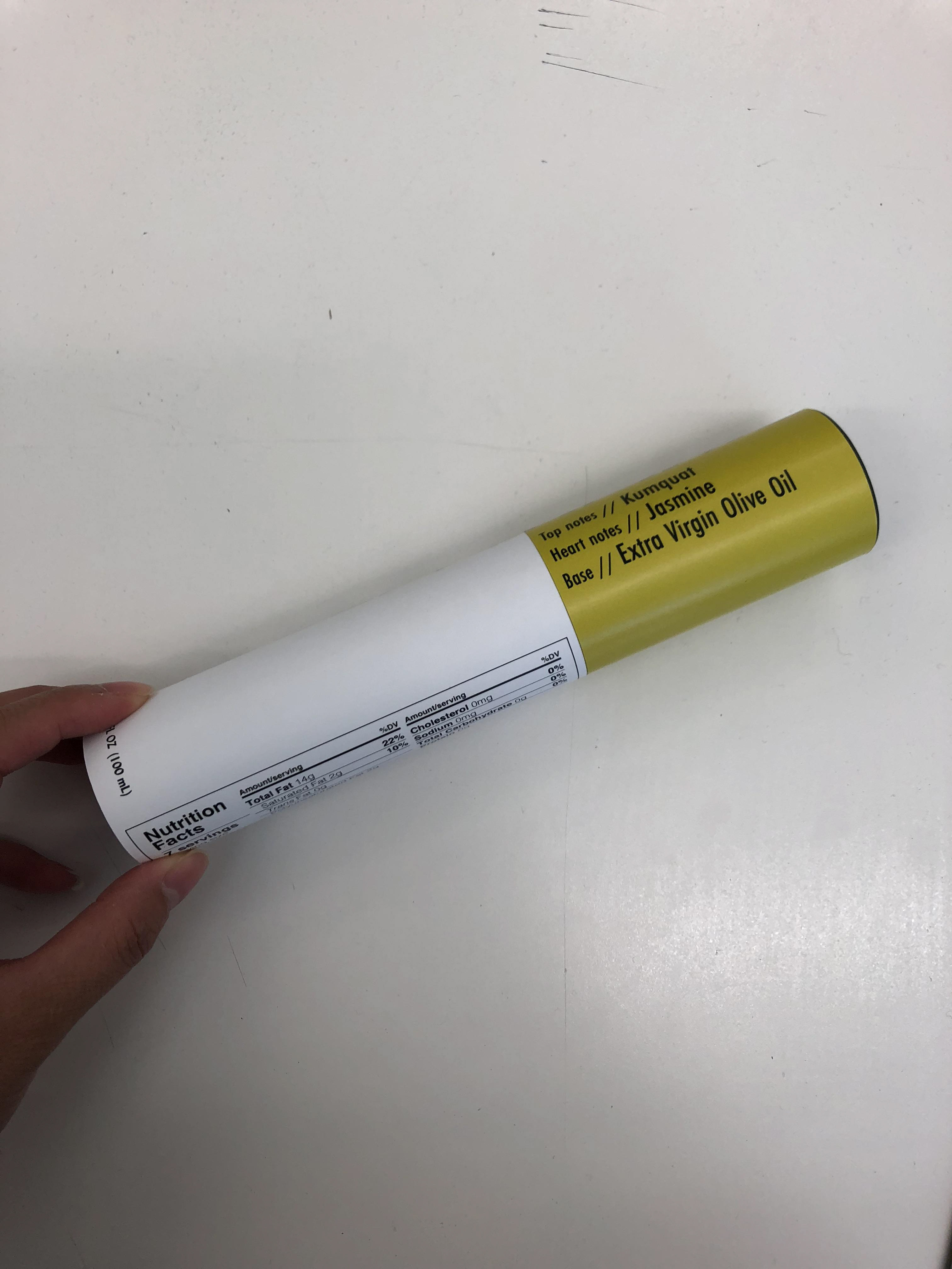
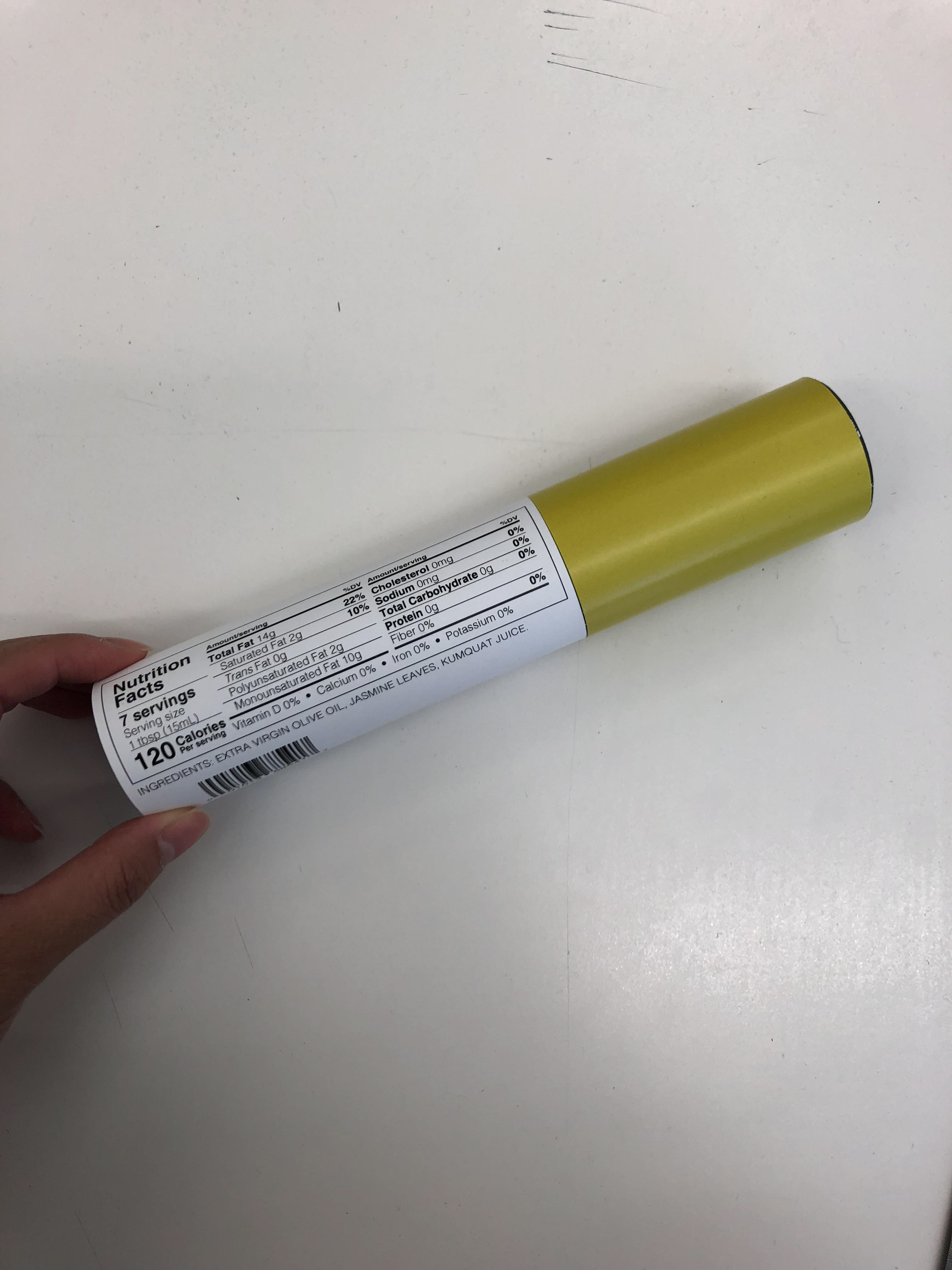
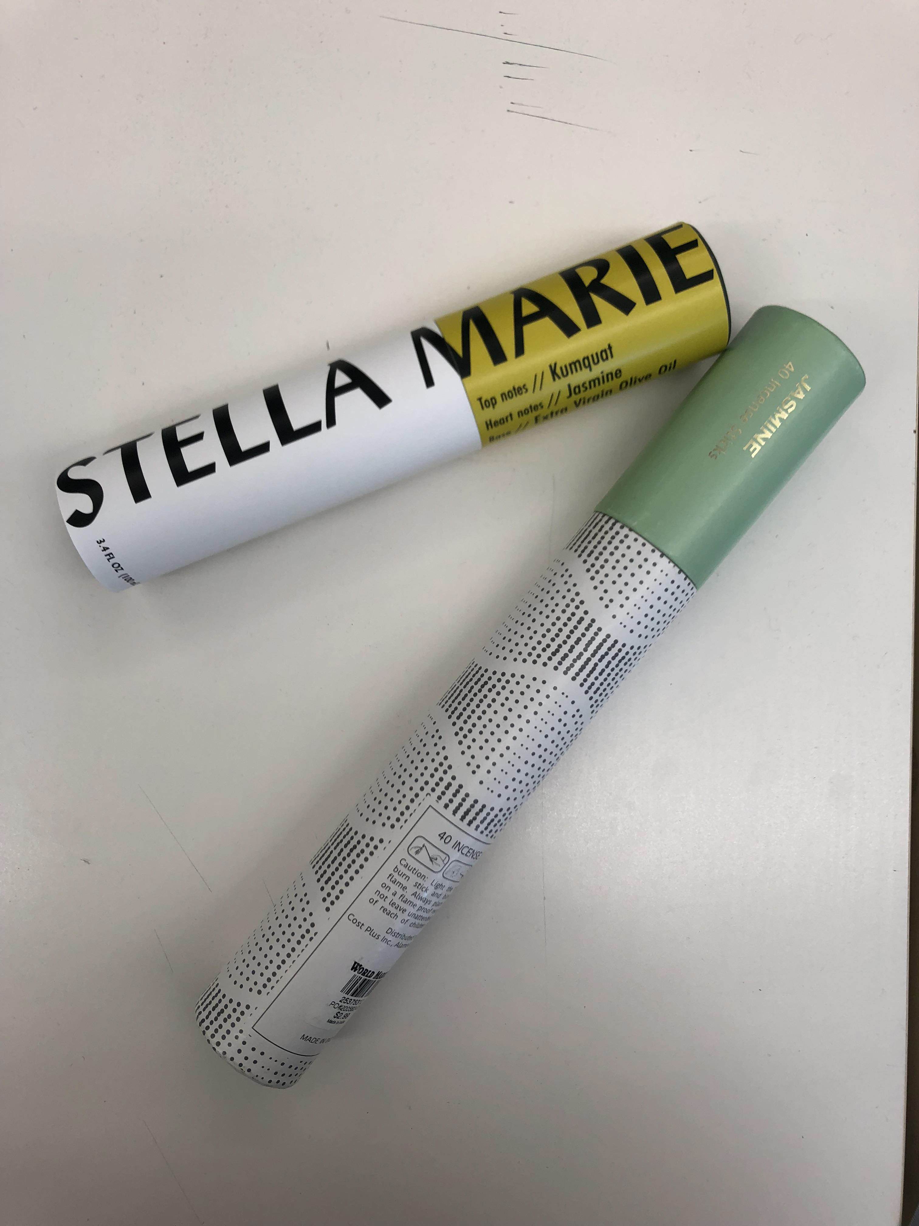
Original form vs the new form manipulated size.
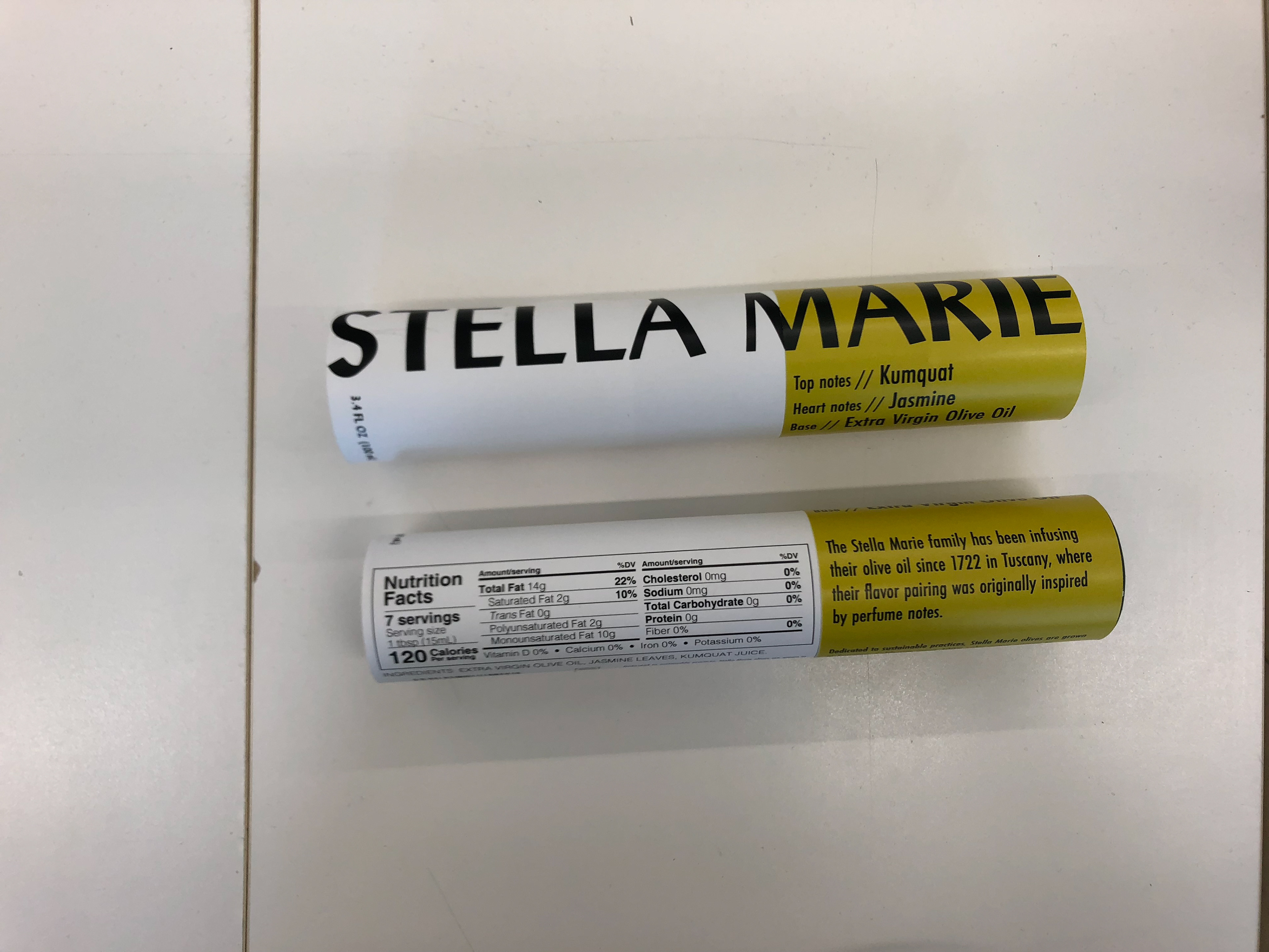
Front and back of the first rough draft wrapped on form.
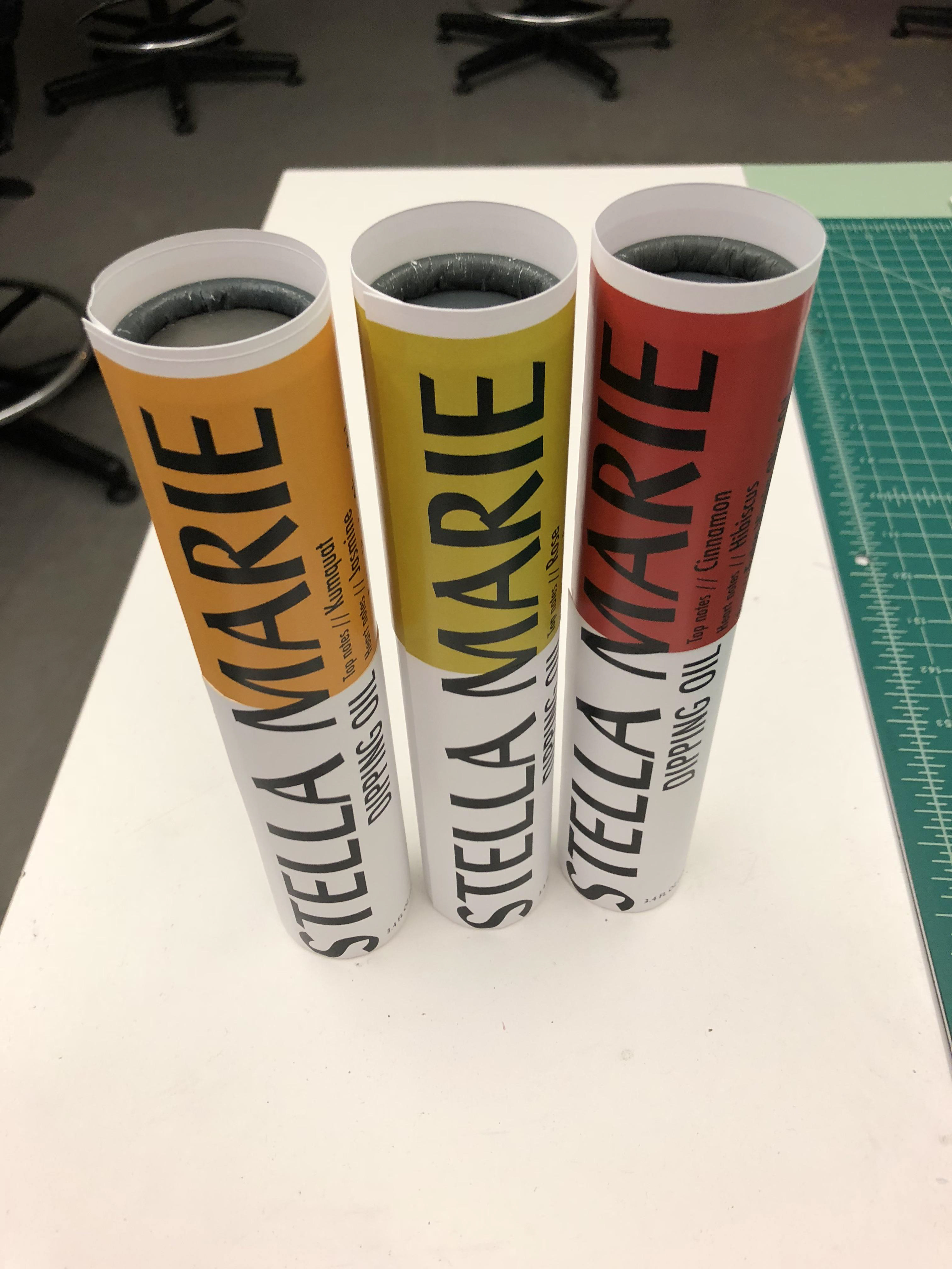
Second rough drafts on form before fitting the tops.
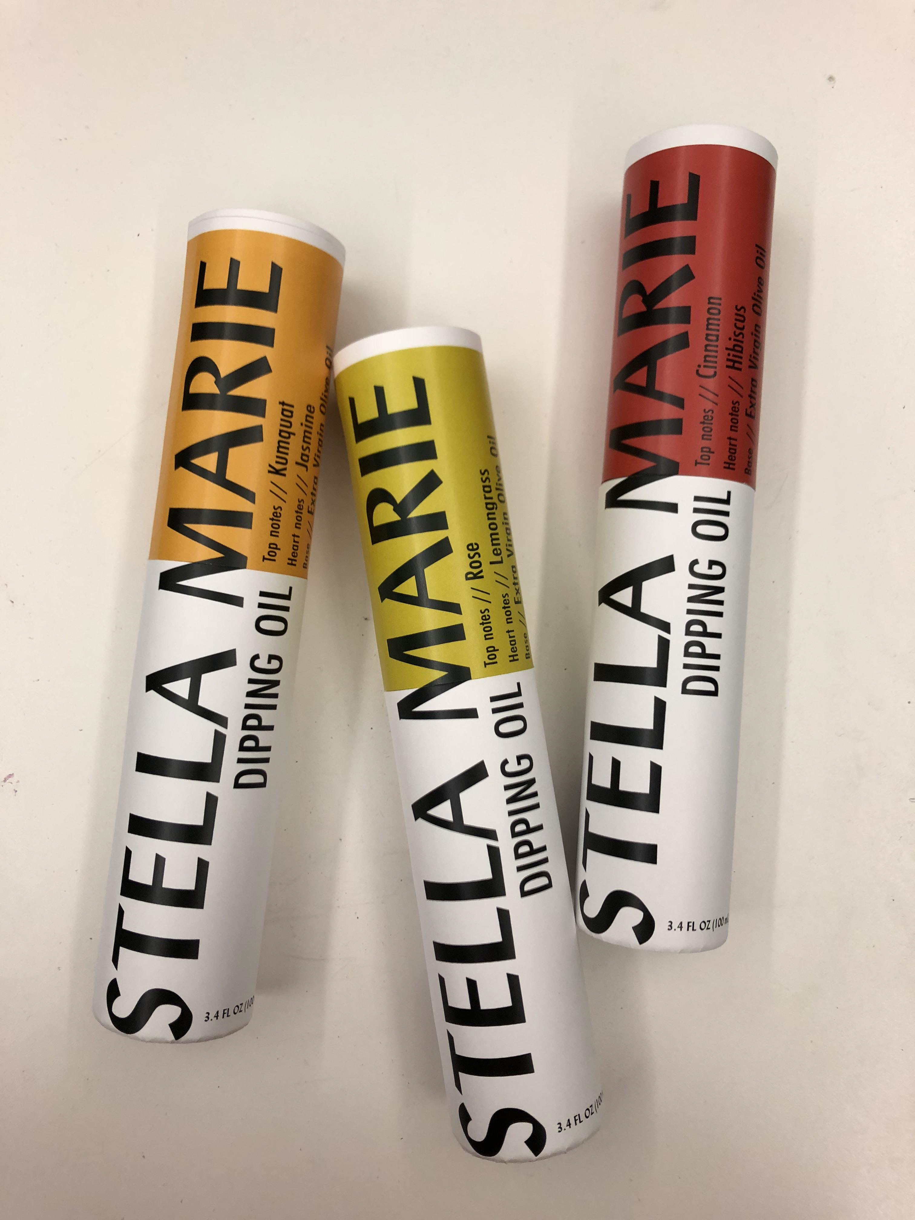
At this point the colors needed to be changed. Brightened and more of a color differentiation between the yellow and green.
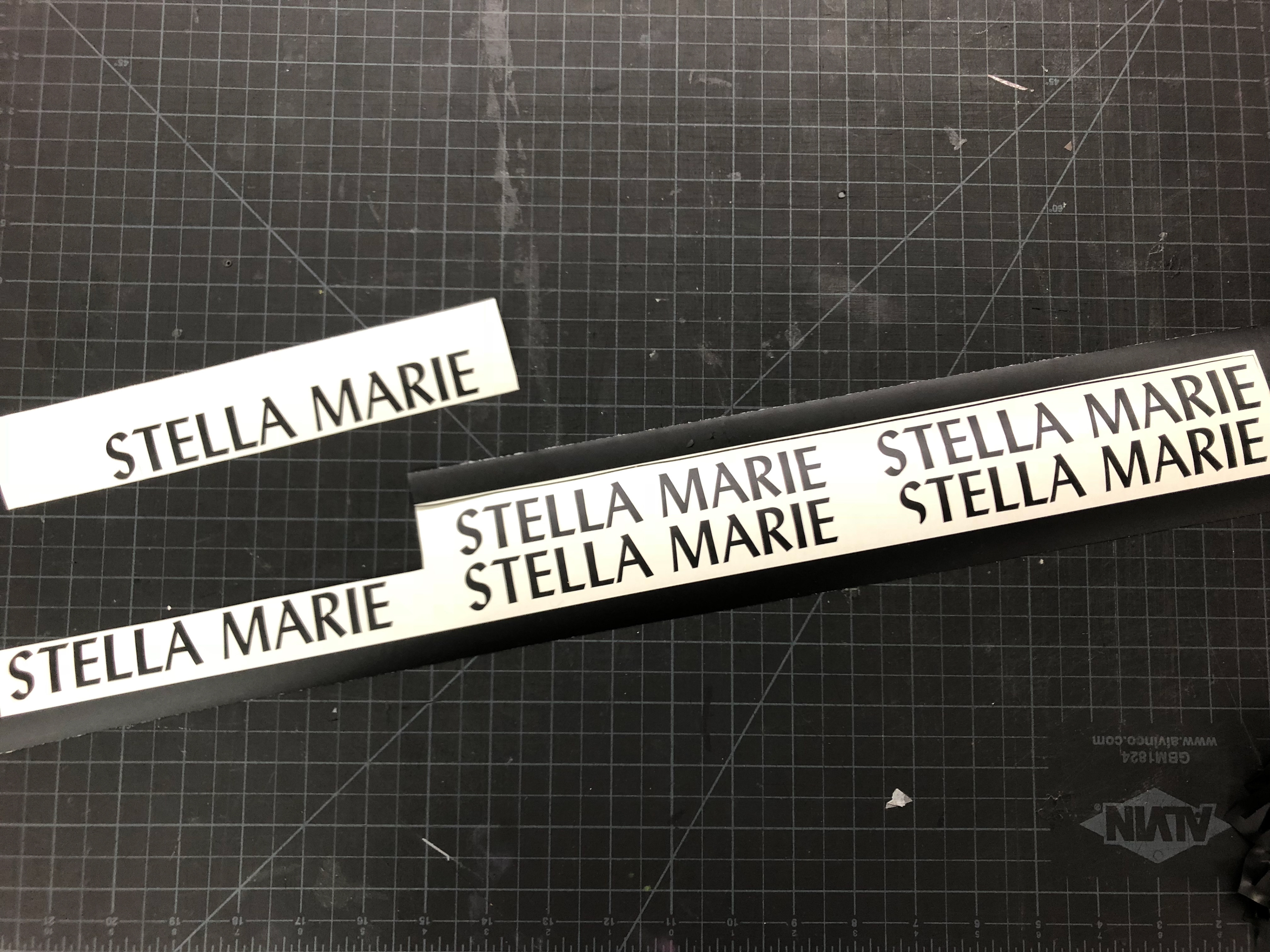
Cutting the vinyl logos.
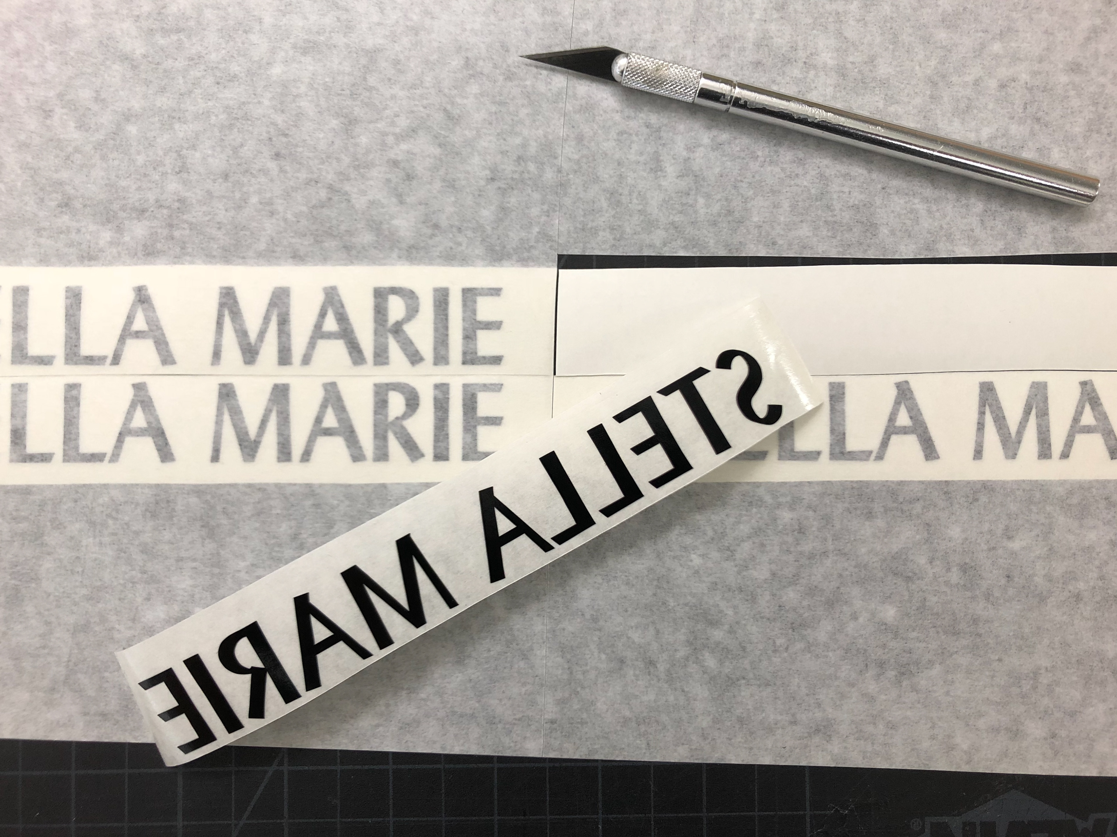
Prepping the vinyl logos to transfer onto form.
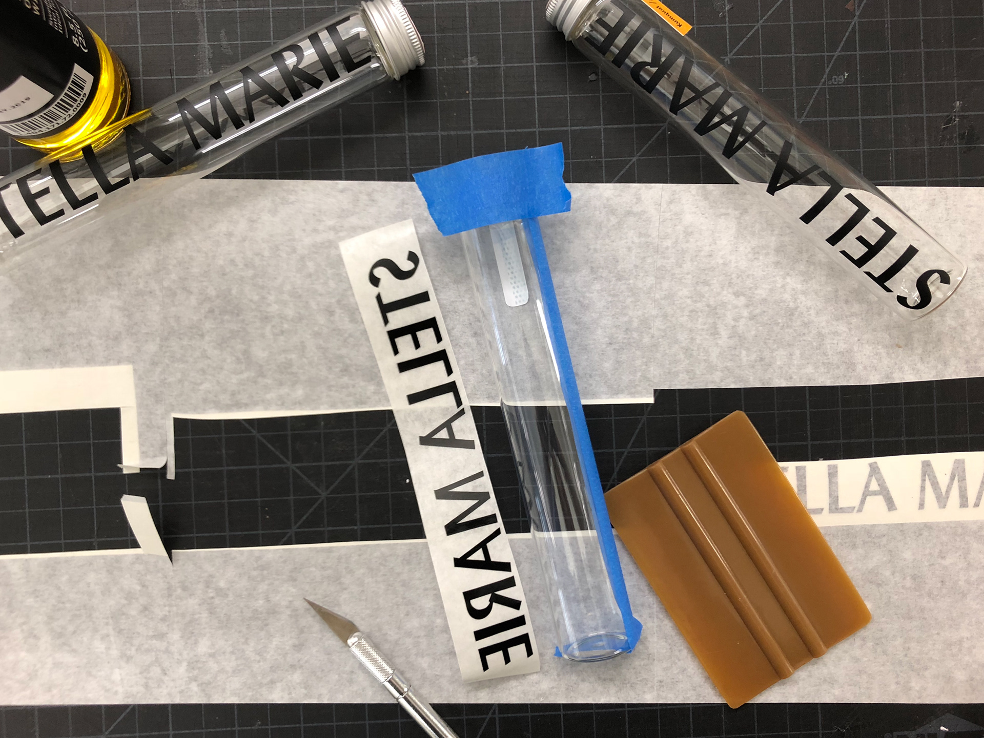
Applying vinyl logo on form.
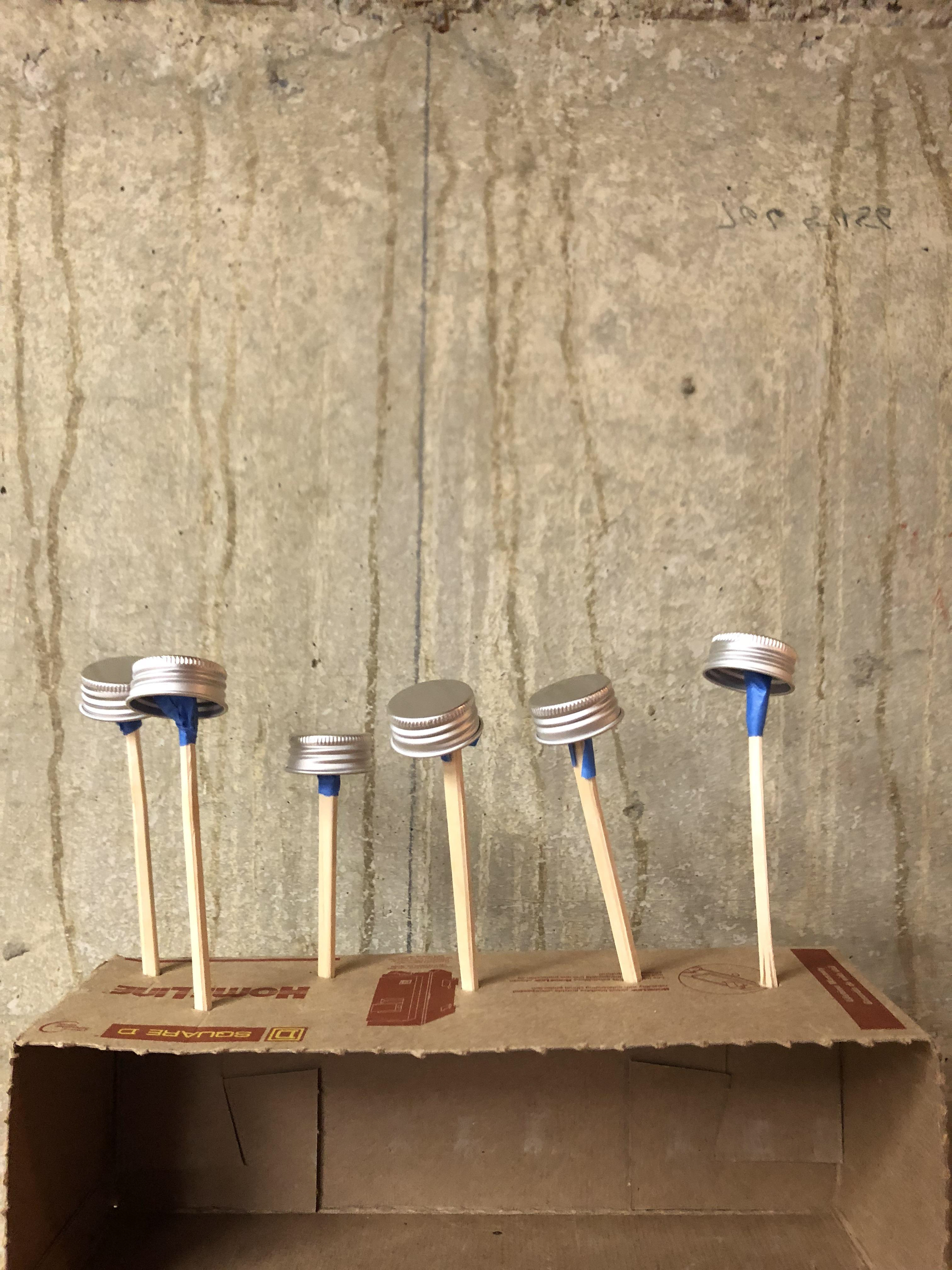
Spray painting caps to match black on packaging.
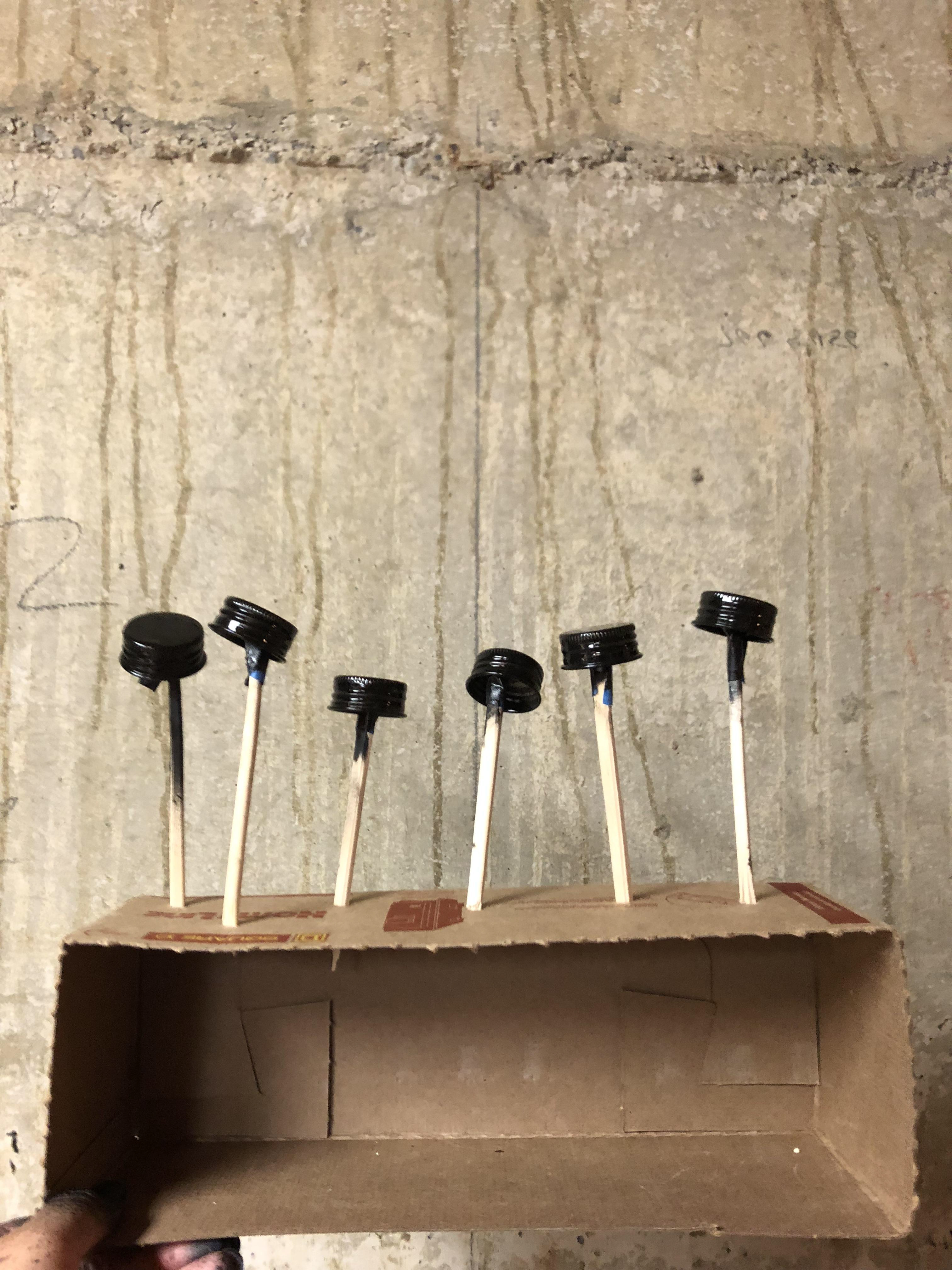
Freshly sprayed caps will dry to a matte black.
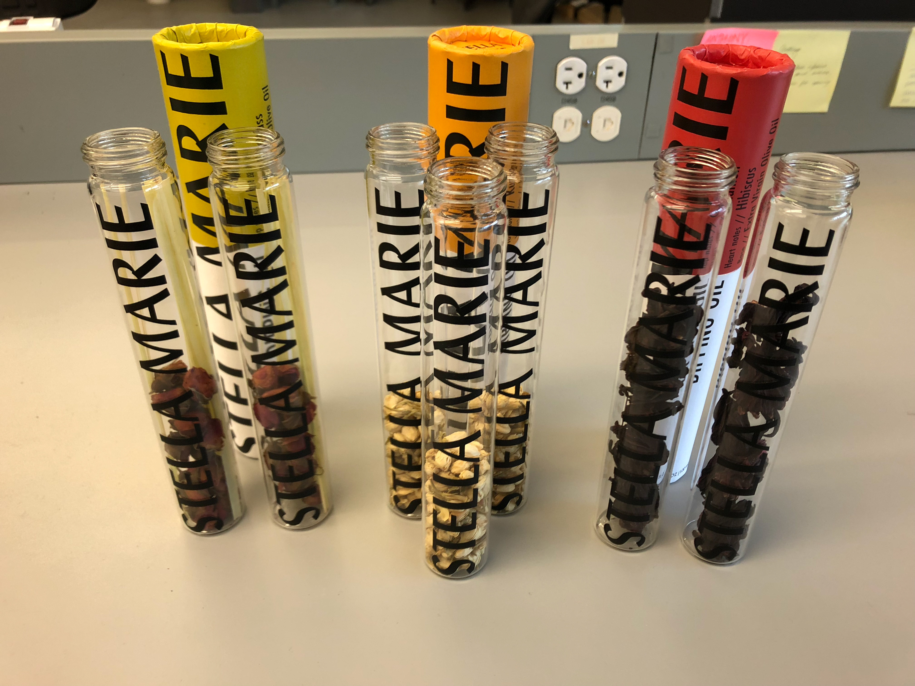
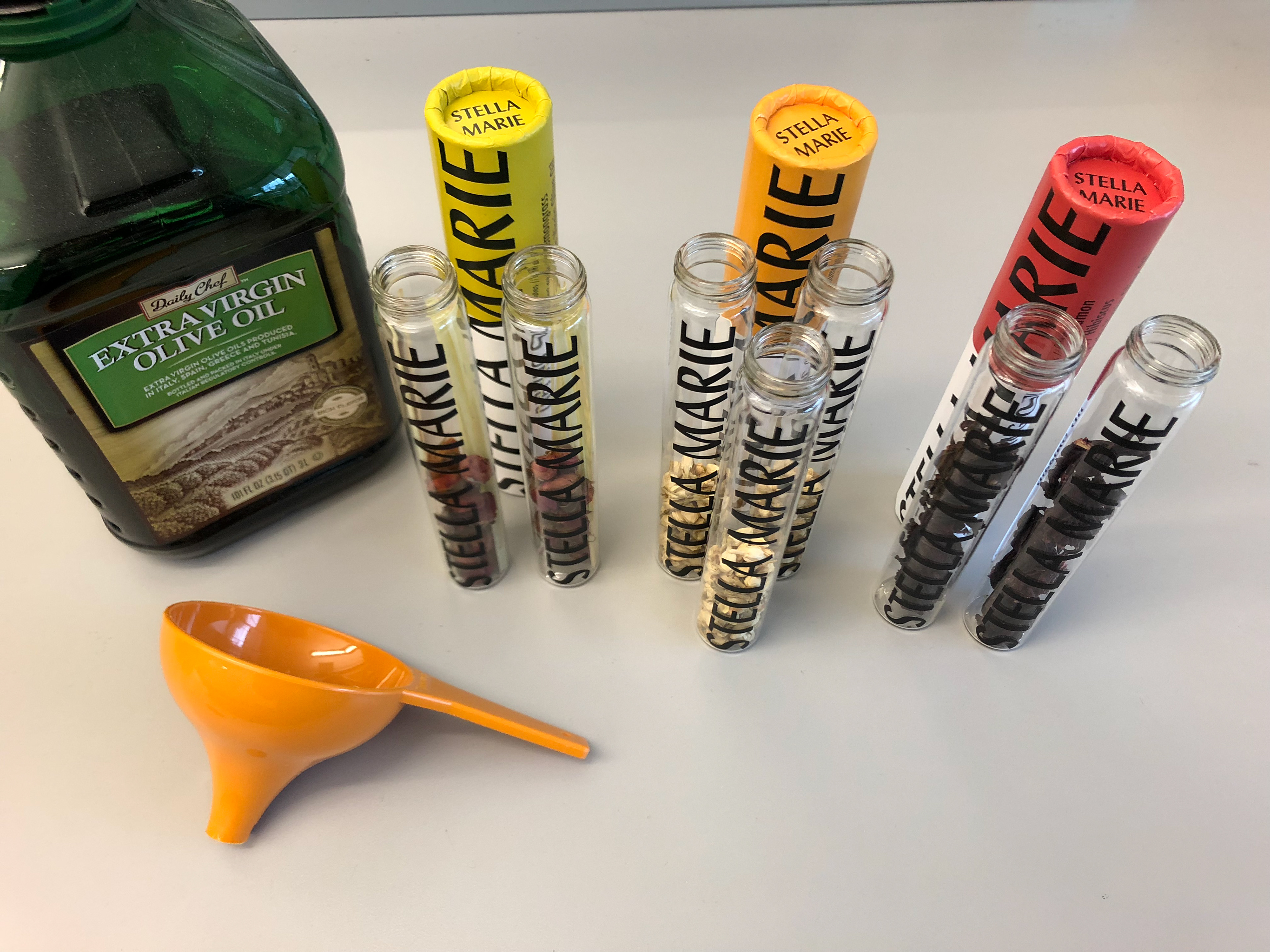
Sourced ingredients to add to each bottle before filling with olive oil.
Final Product Shots
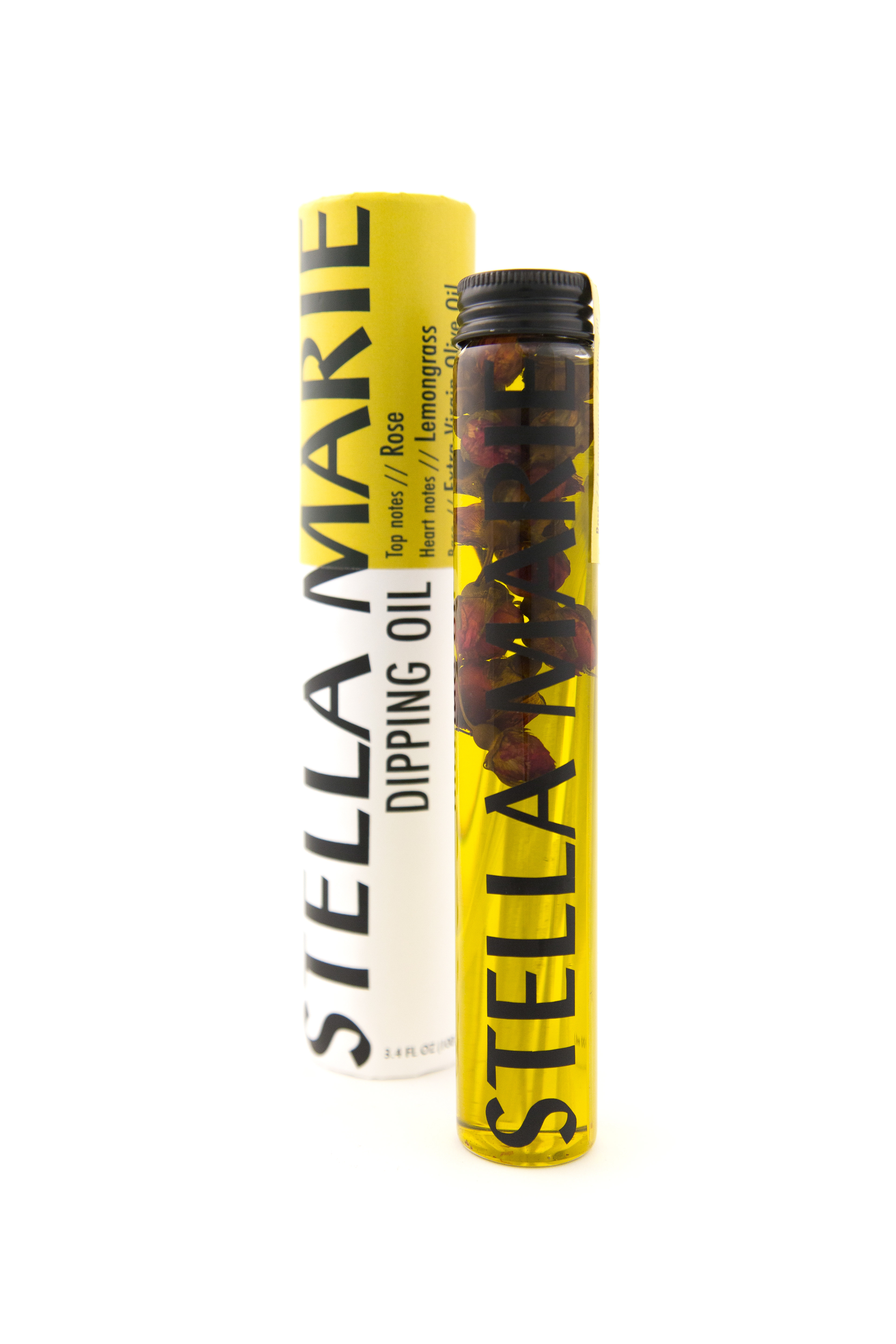
Rose and Lemongrass
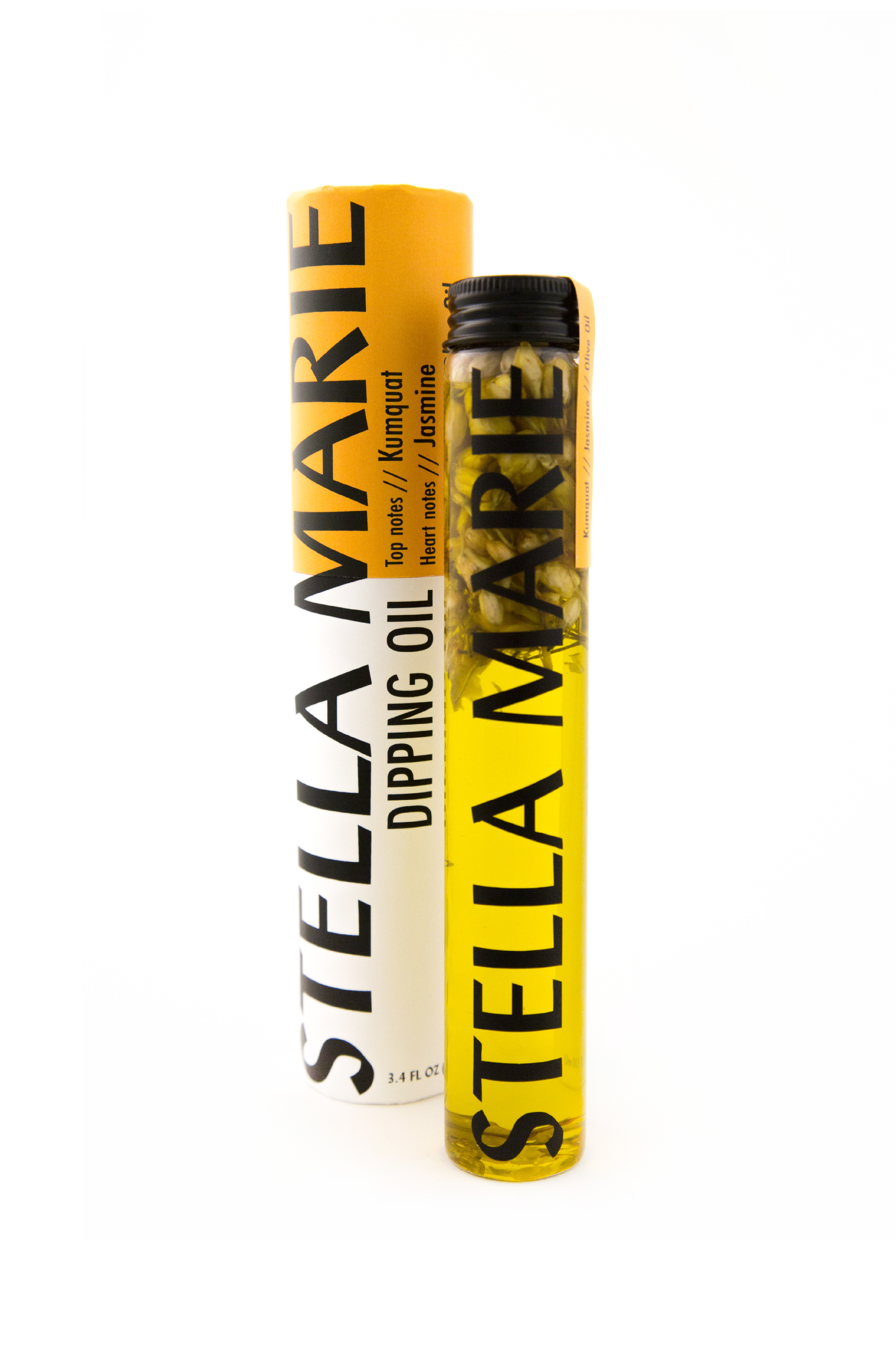
Kumquat and Jasmine
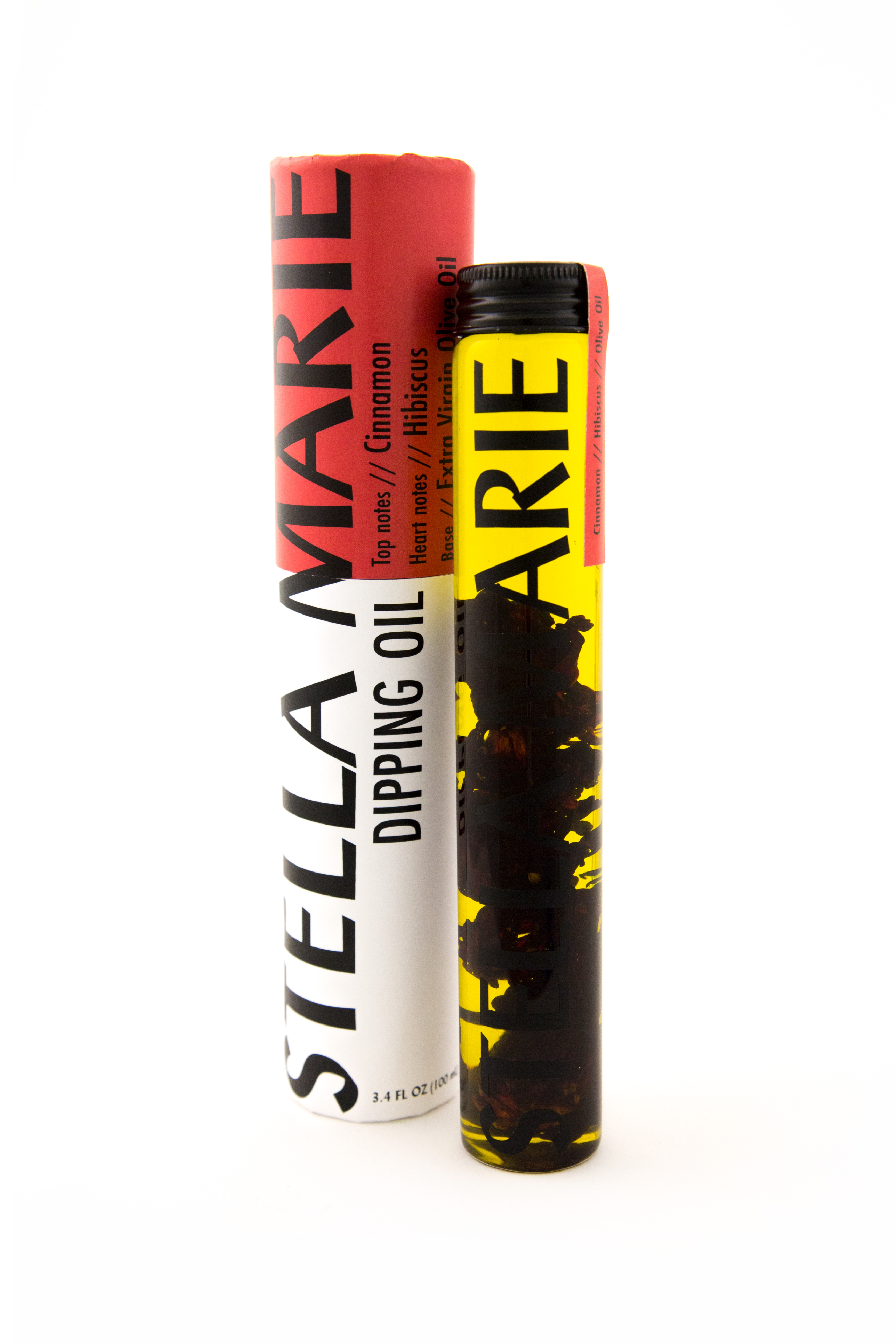
Cinnamon and Hibiscus
